Showing posts with label shift. Show all posts

Jun 3, 2015

Let's Check Out Some Hello Waffle Faves!

Hey, everyone! My Hello Waffle collection is fairly large, and I've been wanting to start swatching them all for you. So, for today, I'm going to swatch and review some shades I know a lot of people love. Next I'll tackle a good chunk of the discontinued Kitty Kingdom collection!


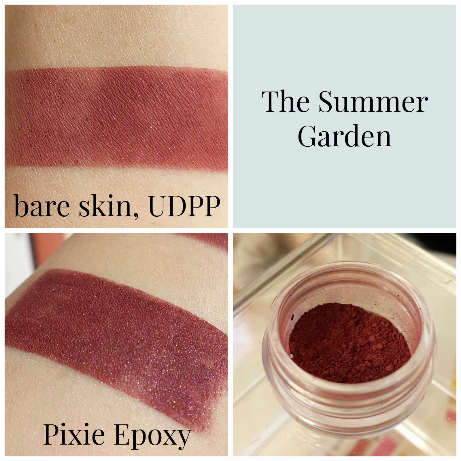
All products have been purchased in full and all opinions are my own. Facial product swatches are swatched heavily on the top row and blended out on the bottom. Eyeshadow swatches are taken over bare skin and Urban Decay Eyeshadow Primer Potion on the top row, and Fyrinnae Pixie Epoxy on the bottom. All quoted descriptions are taken directly from Hello Waffle, and their site can be found here.


Lavender Cream (highlighter): "Creamy white with lavender sheen"

It was so frustratingly impossible to capture the lavender shift of this highlighter. It's ethereal, and honestly, I feel like a beautiful fairy princess when I use Lavender Cream. The powder is very silky and blends down with ease. It has a lot of sparkle, but surprisingly little fallout.


Animate Chess-piece: "Pale dusty pink sheen with a touch of violet"

This is a dusty mauve with a pink sheen and subtle violet sparkle. I love how vibrant the shift is. Animate Chess-piece works best over a glitter adhesive, but doesn't look too shabby over a primer, either!


Purr-ride and Purr-rejudice: "Lady-like blush pink"

Not gonna lie, I bought this one for the label art. Who can resist a kitty in a sweet, pink dress? I hope to someday look as cute as that cat. Label art love aside, this is a beautiful blushy pink. It's very sheer over bare skin, and it's not much better over primer. This is one of those shadows where a glitter adhesive is the only real way to fly.


Ethereal Voice: "Warm purple with noticeable golden shimmer"

I think Ethereal Voice was a lot of people's first love with Hello Waffle. I really want to love it, but it's oh so patchy over bare skin and primer, and it took a lot of work to apply it evenly over Pixie Epoxy. Luckily, the Persinette Collection is being re-released on June 21st (MY BIRTHDAY), and it'll be completely reformulated. For reference, the new Greek Gods and Goddesses Collection from Hello Waffle sports the new formula, and it looks creamy and pigmented over bare skin. So, the new Persinette Collection is a princess worth waiting for.

You better believe I snuck a Tangled quote in here.

That wraps up my post about my most popular Hello Waffle products. I'm excited to swatch more of my Hello Waffle collection. I've been neglecting them lately, and they need some love. The woes of having too many eyeshadows! :P Stay tuned!

Jun 1, 2015

Let's Swatch All of My Femme Fatale!

Today was a lazy Sunday with plenty of sunshine, so I thought I'd update my swatch bank with all of my Femme Fatale goodies. I've reviewed most of the shades before, but I wasn't swatching and photographing my makeup as well back then. I thought it would be nice for a refresher!


All shadows were purchased at full price. All opinions are my own, and all quoted descriptions are taken directly from the Femme Fatale website, which can be found here. Shadow swatches are taken over bare skin and Urban Decay Eyeshadow Primer Potion on the top row, and Fyrinnae Pixie Epoxy on the bottom. Blush swatches are swatched heavily on the top row and blended out on the bottom.


Bone Dust: "a pale taupe with coppery pink shimmer and sparks"

This is a dusty grey/taupe with a subtle copper shift and pink sparks. Straight on, it leans more white than taupe.


Moonglow: "a pale columbia blue with a prominent golden duochrome and subtle pink shimmer"

Femme Fatale's swatch of this really showcases a gold shift, but I couldn't get it to show nearly as well. Nevertheless, it's definitely there, just not as prominent as I would expect.


Candied Apple: "a pale redwood pink with a green undertone, and blends out to have an almost brown undertone to it"

This is one of Femme Fatale's most popular shadow shades, and it's easy to understand why. Over bare skin and primer, this shadow is a rosy brown with green sparks, which makes it great for every day wear. But over a glitter adhesive, it glows green. I wore this as a one-shadow look last week, and my fiance kept complimenting it.


Bat Wing Hall: "a muted puce pink with purple undertones; when applied shifts to be more rosy. complimented with golden shimmers"

This is such a fantastic almost-nude shadow that can be used for a variety of looks. Over bare skin, it's a muted rosy pink, and over primer and glitter adhesive, the golden shimmers really start to pop. I love using this to darken my outer corner and as a crease shade.


Dispersion: "a rich mulberry base with strong aqua shimmer and sparkles. the aqua shifts to a pink/purple at an angle to the light"

Unfortunately, I had a difficult time capturing the rich aqua tones in this shadow. Femme Fatale recommends patting this shadow on rather than swiping (which is pretty standard with duochromes). Dispersion is a beautifully pigmented mulberry with a pink to purple to bright aqua shift. I had some issues with patchiness when applying this, but it wasn't anything a little patience couldn't smooth out.


Darkmist: "a deep red toned brown base with intense violet blue shimmer and teal sparkles"

This is a red toned violet with deep blue shimmer and teal sparks. This is one of the few shadows I own from Femme Fatale that doesn't have a shift to it, but it's beautiful regardless. Darkmist makes for some killer purple smokey eyes.


The Nightmare: "an eggplant purple with intense golden green shimmer and sparkles"

I am such a sucker for shadows that transform over glitter adhesives like The Nightmare does. This is a truly versatile shadow that applies as an cool-toned eggplant purple over bare skin and primer, and comes to life as a deep golden purple with green sparks over glitter adhesive. It's so difficult to describe the final color of this shadow. I feel like it could've easily turned out ruddy looking, but it really shines. If you don't own any shadows like this, I would recommend picking it up with your next purchase.


Fire Bloom (blush): "a mid tone rose pink with coral undertones and a flattering copper gold shimmer"

Fire Bloom is, in my opinion, a must have blush from Femme Fatale. It's a very flattering neutral pink with gold sparkle, but as you blend, the sparkles become more subtle. That's how I prefer my blushes- not too sparkly, but not quite matte. This fits the bill.

Welp, that wraps up the reswatching of my Femme Fatale products! I tried out a different way of laying out my swatch photos with this post. I'd love to hear your opinions on it! Feel free to leave a comment and tell me what you think. As always, I'm open to new ideas and ways I can improve Bellibone Beauty. Stay tuned!

May 2, 2015

Salivating a Tad over Corvus Cosmetics' Kinder-und Hausmarchen Collection

Disclaimer: I am currently in the process of reswatching duochromes and photographing them differently to give my readers a more accurate depiction of the shifts. Please be patient while I go through the process of updating my past reviews. :)

This post is long overdue! After opening last year, Corvus Cosmetics has continued to impress with wonderfully themed collections and stunning shadows. Noel's upcoming projects include a mermaid-based shadow collection, and a line of lipsticks inspired by poisonous flora. I'm always excited to see what Noel has up her sleeve, because she's yet to disappoint for me.

I was quick to snap up the Kinder-und Hausmarchen collection right at release, and it's probably my favorite indie purchase I've ever made. Every color is excellent, and it's been driving me to start using challenging colors (blue shadow, eek!). As usual, Corvus shadows are very impressive over bare skin. There were a few shadows that weren't quite as pigmented over bare skin as I'm used to with Corvus, but if that's my only complaint, I'm a happy camper. This collection is inspired by tales by the Brothers Grimm. Noel includes summaries of each story on every shadow page, which I think is an awesome touch.


I've got a lovely bunch of eyeshadows, all sitting in their rows
(I watched The Lion King a few days back, can't get the songs out of my head)

As per usual, swatches are taken over bare skin, Urban Decay Eyeshadow Primer Potion, and Fyrinnae Pixie Epoxy. All quoted descriptions are taken directly off the Corvus Cosmetics' site, which you can visit following this link.


Barely a Bite: "an apple red with a poisonous green shift", inspired by Little Snow White

Oh lord, this shift is wicked.  A gorgeous warm apple red over bare skin and UDPP, but over Pixie Epoxy, the green shift seriously stands out. Honestly, if you told me this was a Femme Fatale shadow, I wouldn't question you.


Gingerbread Haus: "a matte tan with a complex indigo-purple-red shift", inspired by Hansel and Gretel

I love this shadow, but it's a bit of a contradiction. The shift and sparkle show up best over Pixie Epoxy, but shadows with matte bases don't always behave well over a glitter adhesive. It's a total glitterbomb, so I'm at a crossroads with this shadow. I think, in the end, it'll make me a master at applying Pixie Epoxy. This shadow is a beautiful matte gingerbread-brown over bare skin and UDPP, and I'll likely use it that way as a crease shade. If you can get your Pixie Epoxy application down, this shadow is dramatic and chock-full of purple sparkle over it. I'm such a sucker for shadows with contrasting sparkle like this!


The Devil Told You That: "a soft white highlight sheen with a gold sheen", inspired by Rumpelstiltskin

Normally white shadows don't impress me.. because, you know, they're white. This shadow really impressed me though, because I've found a lot of white shadows tend to be a bit chalky in their consistency. This had the same satin-y feel as the other shadows in the collection, and although it's a semi-sheer highlight over bare skin and primer, it's very pigmented and has an oh-so-subtle gold sheen over Pixie Epoxy. Since it's inspired by Rumpelstiltskin, obligatory Once Upon a Time reference:


The Thirteenth Gift: "a coral pink with a gold shift", inspired by Briar Rose (previously Why Not Zoidberg?)

If you forced me to pick a favorite from this collection, The Thirteenth Gift would be my favorite wearable shadow (my true favorite is Bluebeard). Over bare skin, it's a feminine coral-tinged pink. The gold shift shows up over both primer and epoxy, but the sparkles are more prominent over a glitter base (duh). This shadow is very versatile and the shift is stunning.


Death at His Feet: "a dark chocolate brown with a satin finish", inspired by The Godfather (previously Fine Jamaicon Bacon)

This is a deep chocolate shadow with subtle brown sparks. I had some issues with patchiness over bare skin, but it smoothed out over primer. For some reason, my camera was just not having taking pictures of my Epoxy swatch. Well, now you have a good idea of the sparkle!


Golden Slipper: "a champagne gold with a slight shimmer", inspired by Cinderella (previously Champaggin)

This shadow is a very intimidating mustard yellow in the jar, but it applies a soft, vintage gold with a touch of silver sparkle. This goes great paired with my neutrals, and is beautifully pigmented over bare skin, primer, and glitter base.


He Was No Frog: "a pastel blue-green with a gold shift", inspired by The Frog King (previously Good News Everyone)

Out of all the shadows from the collection, this one is the one I like the least. Almost nonexistent over bare skin, fairly sheer over primer, and a little chalky over Pixie Epoxy. The gold shift was very subtle. I feel like this shadow doesn't really live up to the standards of Corvus, and it could benefit greatly from some formula tweaking. It's a great color, but it has pigmentation and consistency issues for sure. (Noel just let me know that this shadow will be tweaked soon, along with Thirteenth Gift and her other pastel-based shadows! Yay!)


Nightingale: "a mid-toned aubergine with a subtle shimmer", inspired by The Nightingale and the Blindworm

I am such a sucker for purples, and luckily, this isn't a kind of purple I had in my collection yet. It's an eggplant purple with a touch of purple and pink shimmer. The consistency of Nightingale was plush and velvety. A must-have for the purple-obsessed!


Let Down Your Hair: "a soft nude-pink with lots of shimmer", inspired by Rapunzel (previously Smizmar)

This is my new favorite nude. A slightly rosy nude with an insane amount of glitter, Let Down Your Hair is a beautiful shadow. It can pair with just about anything.


The Better to Eat You With: "an antique silver with deep brown undertones", inspired by Little Red Cap (previously Bite My Shiny Metal @$&!)

I'm so, so glad this shadow made it into this collection. An unassuming brown over bare skin, with a hint of silver over primer, and then BAM! Over Pixie Epoxy, this shadow is an explosion of silver glitter. I mean, it's a ridiculous amount of glitter. I love it.


Goodbye Hans: "a bright orange with gold shimmer", inspired by Clever Hans (previously Orange Joe)

If you aren't familiar with the story of Clever Hans, please follow this link to read Noel's excellent summary. Then come back here. ...you done? Yeah, Hans isn't clever. He's frankly a bit of a dumbass. Whenever you think you have relationship problems, remind yourself that Hans threw eyeballs at his fiance. Anyway, this shadow is a pigmented, bright orange with gold sparks. 


The Summer Garden: "a midtoned rosy purple", inspired by The Summer Garden and the Winter Garden

I had some issues with patchiness overall with this shadow, and it was fairly sheer over bare skin. Over bare skin and primer, I'd call this shadow a burgundy, but over Pixie Epoxy, the purple shows through.


Bluebeard: "a velvety navy blue", inspired by Bluebeard

This shadow was sheer over bare skin, but improves over primer. Over Pixie Epoxy, this shadow is by far the most gorgeous blue I've ever seen in a shadow. When I was working on taking my pictures, my fiance looked over and had me walk over to show him the swatch. That's a big deal, guys. The Epoxy picture really speaks for itself. This is wicked pigmented, and for me, this is the standout shadow of the collection. I never thought I'd like a blue shadow the way I do this one. If this shadow was a person, I'd marry them. (Sorry, Charles..)


Three Ravens: "a satiny black with strong blue undertones", inspired by The Three Ravens

This shadow has some pigmentation issues over bare skin and primer, but it's a deep blue-black over Pixie Epoxy. There are some subtle white sparkles scattered throughout.

Phew! This wraps up my review of the Kinder-und Hausmarchen Collection from Corvus Cosmetics. As I said, this post was long overdue! I'm so glad I picked up this collection, and I'd recommend it to anyone looking to add to their stash. My next post will be a comparison between Performance Colors' Zombie Bride Lipstick and Fyrinnae's Wizardry Liquid Lipstick. Stay tuned!

Apr 4, 2015

Checking Out Dark Matter's Stardust Shadows and Gravity Primer

Disclaimer: I am currently in the process of reswatching duochromes and photographing them differently to give my readers a more accurate depiction of the shifts. Please be patient while I go through the process of updating my past reviews. :)

Hey, guys! I took a bit of a break last week after a bout of writers' block, but now I'm back! Today I'm going to swatch and review four Stardust shadows from Dark Matter, as well as put their new(ish) Gravity primer to the test. Dark Matter opened in 2012, and came to light in IMAM last year. This is my first order from Dark Matter, but I'd been eyeing the company for a while. From a collection honoring badass female contributors to the world of science, to adorable star shaped swatches, I've been impressed.

When Dom released the Gravity Eyeshadow Primer, I finally bit the bullet and placed my order. My purchase was for three eyeshadow samples, and came with an additional shadow sample and a clamshell sample of the Gravity Primer. Keep in mind non-GWP shadow samples come in "test tubes". Such a cute name, and the tubes hold true to the science theme of Dark Matter, but they're very skinny and my brush couldn't fit in them. For my review today, I poured a tiny bit onto a business card and used them from there. When my shipment of jars arrives, I'll be depotting these. Sometimes theming needs to take a backseat to practicality.


L-R: Aries, Virgo, Aquarius, Betelgeuse, Gravity Eyeshadow Primer

Because I'm reviewing Dark Matter's Gravity Primer, my swatches are going to be a little different. From left to right and top to bottom, shadows will be swatched over bare skin, Urban Decay Eyeshadow Primer Potion, Fyrinnae Pixie Epoxy, and Dark Matter's Gravity Eyeshadow Primer. As usual, all quoted descriptions are taken off Dark Matter's Etsy shop page, which you can check out here!


The elusive Gravity Primer in its natural habitat..

Let's start off with my first impression of Gravity, Dark Matter's primer. Gravity was advertised as part primer, part glitter glue. I'd say this is definitely a bit of both. It's a milky white both in the clamshell and on my skin, and stays tacky on your skin after applying. The consistency feels somewhere between Pixie Epoxy and e.l.f. Glitter Glue. I've yet to give this a test run, but I'll report back when I do! So far I feel like I haven't quite mastered the application yet. Onto the shadows!


Aries: "a light metallic gold with gold sparks"

This was a pale metallic dandelion yellow with gold sparks. It didn't hold up too well over bare skin, but looked nice over my primers. I think it performed the best over Pixie Epoxy, but I also think I went too heavy on the Gravity primer. A little goes a looong way, and I didn't realize it.


Virgo: "a light pink that has a golden duochrome"

This shadow leaned lilac on bare skin and UDPP, but was true to description over Pixie Epoxy and Gravity. This is a really delicate shade, and I'll be pairing it with brighter pinks and rose golds for Spring.


Aquarius: "a duochrome that shifts from a dark, yet pure blue to a metallic gold"

I was really impressed with the pigmentation over bare skin here. I wouldn't consider this to be a duochrome, however. Over primers, the shadow definitely transforms, but the color doesn't shift depending on the angle you look at it or the light hitting it. For me, the blue doesn't change to a metallic gold, but rather an antiqued green-gold. It isn't very true to the description, but I still like it.


Betelgeuse: "a chocolate burgundy base under an extreme flash of gold glittering highlight"

This actually ended up being my favorite of the bunch! This is a shadow that has the "glowing from within effect" that I love so much. The antique gold really pops over the dark base. I think the glowing effect is lost a bit over Gravity Primer.

Overall, I was pretty impressed with my order. The Stardusts are very pigmented over bare skin, and they look so beautiful over Pixie Epoxy and Gravity. I can't wait to try Aquarius and Betelgeuse as liners! Gravity is a great option for those who don't want to pick between a primer or a glitter glue. But since it's a bit of both, don't expect it to make your shadows pop like Pixie Epoxy does. In terms of learning how to apply it, I'd say it has the same learning curve as Pixie Epoxy. I also think that because of its color, it might not look quite right on someone with darker skin that me. I'm glad I was sent a sample of Gravity, but since I already have a primer and glitter glue I love, I likely won't be purchasing a full size unless it performs wonderfully on my oil slick eyelids.

Well, that wraps up my review! I'd definitely recommend Dark Matter to any indie lover. Dom definitely didn't disappoint, and I'm excited to see what she comes up with next!

<a href="http://www.bloglovin.com/blog/13553453/?claim=q7aqenwmaea">Follow my blog with Bloglovin</a>

Mar 16, 2015

Drooling a Bit Over Fyrinnae's Shadows and Blushes

Disclaimer: I am currently in the process of reswatching duochromes and photographing them differently to give my readers a more accurate depiction of the shifts. Please be patient while I go through the process of updating my past reviews. :)

Part two of many from my /r/CatsandCosmetics exchange extravaganza, this post centers around Fyrinnae. I received four shadows and three blushes, and I'm excited to share my thoughts with you guys! My camera was not having it with jar photos today, so some look better than others. I know my swatches are far more important, and those turned out fine. so I gave my camera a scolding and pressed on.


L-R, T-B: Rapunzel Had Extensions, Envy Me, Feisty Fennec Fox, Mephisto
Enchant, Greek Goddess, Charm

As usual, shadow swatches are taken over bare skin on the left and Fyrinnae Pixie Epoxy on the right. Blush swatches are blended out over bare skin. All quoted product descriptions are taken directly from Fyrinnae's website, which can be found here.


Rapunzel Had Extensions: "pale pink with a stunning brilliant light gold highlight"

Fyrinnae's all-time top selling shade, and for a reason. A pink-orange in the jar, this shadow applies a light gold over bare skin and Pixie Epoxy. The semi-loose formula of their shadow works so beautifully with their Pixie Epoxy; they really are a match made in heaven. This is just such a light and gorgeous shadow. I understand the hype now, and I'm kicking myself for not already having this shadow in my collection.


Envy Me: "soft tan-taupe with a green highlight"

I can absolutely vouch for the formula of this shadow, and the shadow description is spot on, but I'm not finding myself too in love with this color. I feel the green and taupe don't go well together, and it resulted in a shadow that looks a little muddy to me. If you like the color, absolutely snatch it up when you can.


Feisty Fennec Fox: "cool gray-taupe finished with a pale gold satiny highlight"

I've been on the prowl for a grey shadow that doesn't turn into a metallic silver over a primer, because I feel a lot of them do that. This is the shadow I've been looking for! The gold highlight was oh so subtle, and just enough to keep the shadow looking interesting. Without that highlight, this shadow probably would've fallen flat for me. Also, for some reason I found the way it looked in-jar absolutely adorable. Like little, cute makeup pebbles. Does anyone else think it's cute somehow? Am I crazy?


Mephisto: "a dark royal blue with a vibrant metallic red sheen"

This shadow is.. interesting. It applied very patchy, and I had to use quite a bit of product to fill in the spaces that looked sparse. I wasn't getting the right color out of it, and when I checked Fyrinnae's page, it suggested to add even more shadow to get that proper red sheen rather than the copper I was getting. That seemed a little high maintenance. By the time I went to add even more shadow, my Epoxy was dry and I decided to leave it be. Unless you're fine with packing on a lot of shadow (and possibly using two layers of primer) to get the color you see on Fyrinnae's page, this is what you get. I'll post a swatch of it after adding multiple layers if anyone's interested, but I felt it was important to show what one layer of the shadow looked like. It's a pretty shadow, but it's too high maintenance for me. This is my first time feeling frustrated with a shadow.


Enchant: "vibrant peach with a very slight touch of pink shimmer"

Fyrinnae's most popular blush since 2006, and I have to say, I'm surprised. This is a fabulous bright peach, but you would think their most popular blush would be a tad more wearable. With Enchant, and all the Fyrinnae blushes I'll be reviewing, I have to stress that these will look best on darker skin, unless you're a bit of a daredevil like me and are willing to brave the outside world with bright-ass cheeks. If you're wanting your cheeks to look less pigmented than my swatches, you need to start out with the teensiest amount imaginable. Use a stipple brush, or any brush with stiffer bristles, and pat the product on your cheeks with a light hand. Don't do anything except pat with that brush, and don't worry if it looks patchy or silly. Then take a blush brush and blend it like crazy. If it still looks a bit patchy, or if you'd like more pigmentation, repeat those steps over again. Also, for the love of Pete, do NOT dip your brush directly into the jar. That will result in pumpkin cheeks and perhaps an overturned piece of furniture. Tap some blush onto a flat surface, like the bottom of the lid, before you do anything. Don't expect to be an expert at applying these right off the bat, because you won't be. There's a learning curve for sure, but indie blushes are amazing and the struggle is worth it. #blushstruggles


Greek Goddess: "vibrant pink with a very slight pink shimmer"

Out of these three blushes, I would say this one is the tamest of them all. It still takes a light hand to apply, but it blends out to be a very pretty rosy pink rather than the pinkish coral you see in the jar. Fyrinnae states that it doesn't contain titanium dioxide or whiteners, so it's ideal for blending on darker skin. Really, I think this blush would look fabulous on a variety of skin tones.


Charm: "vibrant cool pink with the slightest touch of shimmer"

I'm not going to lie, this blush intimidated the crap out of me when I opened the jar. This is Barbie pink, and I never thought it could work. But Fyrinnae continues to surprise and impress, because this blends out to be a wearable cool pink. Honestly, I didn't think any of these three blushes could ever look okay on me. I'm excited to incorporate all three into my everyday looks!

That wraps up my post for today! I'm thinking about perhaps doing a tutorial for my next post. Some of the discussion today on IMAM has made me want to branch out and do more than just swatches and reviews, as helpful as they can be. If you have any ideas for future posts here, please let me know in the comments!