Showing posts with label duochrome. Show all posts

Jun 1, 2015

Let's Swatch All of My Femme Fatale!

Today was a lazy Sunday with plenty of sunshine, so I thought I'd update my swatch bank with all of my Femme Fatale goodies. I've reviewed most of the shades before, but I wasn't swatching and photographing my makeup as well back then. I thought it would be nice for a refresher!


All shadows were purchased at full price. All opinions are my own, and all quoted descriptions are taken directly from the Femme Fatale website, which can be found here. Shadow swatches are taken over bare skin and Urban Decay Eyeshadow Primer Potion on the top row, and Fyrinnae Pixie Epoxy on the bottom. Blush swatches are swatched heavily on the top row and blended out on the bottom.


Bone Dust: "a pale taupe with coppery pink shimmer and sparks"

This is a dusty grey/taupe with a subtle copper shift and pink sparks. Straight on, it leans more white than taupe.


Moonglow: "a pale columbia blue with a prominent golden duochrome and subtle pink shimmer"

Femme Fatale's swatch of this really showcases a gold shift, but I couldn't get it to show nearly as well. Nevertheless, it's definitely there, just not as prominent as I would expect.


Candied Apple: "a pale redwood pink with a green undertone, and blends out to have an almost brown undertone to it"

This is one of Femme Fatale's most popular shadow shades, and it's easy to understand why. Over bare skin and primer, this shadow is a rosy brown with green sparks, which makes it great for every day wear. But over a glitter adhesive, it glows green. I wore this as a one-shadow look last week, and my fiance kept complimenting it.


Bat Wing Hall: "a muted puce pink with purple undertones; when applied shifts to be more rosy. complimented with golden shimmers"

This is such a fantastic almost-nude shadow that can be used for a variety of looks. Over bare skin, it's a muted rosy pink, and over primer and glitter adhesive, the golden shimmers really start to pop. I love using this to darken my outer corner and as a crease shade.


Dispersion: "a rich mulberry base with strong aqua shimmer and sparkles. the aqua shifts to a pink/purple at an angle to the light"

Unfortunately, I had a difficult time capturing the rich aqua tones in this shadow. Femme Fatale recommends patting this shadow on rather than swiping (which is pretty standard with duochromes). Dispersion is a beautifully pigmented mulberry with a pink to purple to bright aqua shift. I had some issues with patchiness when applying this, but it wasn't anything a little patience couldn't smooth out.


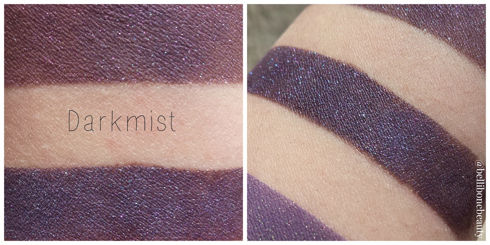
Darkmist: "a deep red toned brown base with intense violet blue shimmer and teal sparkles"

This is a red toned violet with deep blue shimmer and teal sparks. This is one of the few shadows I own from Femme Fatale that doesn't have a shift to it, but it's beautiful regardless. Darkmist makes for some killer purple smokey eyes.


The Nightmare: "an eggplant purple with intense golden green shimmer and sparkles"

I am such a sucker for shadows that transform over glitter adhesives like The Nightmare does. This is a truly versatile shadow that applies as an cool-toned eggplant purple over bare skin and primer, and comes to life as a deep golden purple with green sparks over glitter adhesive. It's so difficult to describe the final color of this shadow. I feel like it could've easily turned out ruddy looking, but it really shines. If you don't own any shadows like this, I would recommend picking it up with your next purchase.


Fire Bloom (blush): "a mid tone rose pink with coral undertones and a flattering copper gold shimmer"

Fire Bloom is, in my opinion, a must have blush from Femme Fatale. It's a very flattering neutral pink with gold sparkle, but as you blend, the sparkles become more subtle. That's how I prefer my blushes- not too sparkly, but not quite matte. This fits the bill.

Welp, that wraps up the reswatching of my Femme Fatale products! I tried out a different way of laying out my swatch photos with this post. I'd love to hear your opinions on it! Feel free to leave a comment and tell me what you think. As always, I'm open to new ideas and ways I can improve Bellibone Beauty. Stay tuned!

May 22, 2015

Fyrinnae Wizardry vs Performance Colors Zombie Bride

I promised a comparison post between Fyrinnae Wizardry and PC Zombie Bride a while back, and today I delivered! We all have a little hole in our hearts where Performance Colors once sat, so I decided to see if the wound could be mended a little. See for yourself!


Both products purchased by me (Wizardry) and a friend (Zombie Bride). All opinions are my own, and all quoted descriptions are taken from the product's respective company. Lip swatches are taken over moisturized lips and a layer of clear lip liner.

Fyrinnae Liquid Matte Lipstick in Wizardry: "deep burgundy base with a highlight which changes from turquoise-blue to purple to pink"

This is a liquid lipstick that dries down to a semi-metallic finish. The base is a deep burgundy/purple with turquoise sparks and a magenta shift. This lipstick does not budge, so it stains a bit and can be hard to remove. It has a tendency to feather, and even over my clear lip liner, it began to feather as it dried down. Because of its thin consistency, application takes practice. I think the key to prevent feathering and ensure cleaner lines is to use several thin applications, and allowing the product to dry in between.

Performance Colors Restorative Lipstick in Zombie Bride: "frenzied bruised purple with a high blue sheen"

This is a solid lipstick in a balm tube, which makes it hard to apply in my little Cupid's Bow. For this reason, I applied with a lip brush for this post. It's a deep red-toned purple with turquoise sparks and a strong blue to magenta shift depending on the angle. The product is a little gritty, and it likes to highlight dry patches on your lips if you apply straight from the tube. It smudges easily and quickly fades down to a magenta base.


So here I swatched Fyrinnae Wizardry on top and PC Zombie Bride on the bottom. I applied Zombie Bride straight from the tube. Both formulas had some issues with patchiness and streakiness, which seems to be the price paid for darker indie lip products. Overall, it took more work to even out Zombie Bride, and even then I couldn't get it quite right. In the sun, Wizardry's sparks stand out more than the shift itself, and Zombie Bride is the opposite. I attribute this to the fact that Wizardry dries down more matte than Zombie Bride. The wetness of Zombie Bride allows for more sheen. I think all in all, these are good color dupes, but are (for obvious reasons), not formula dupes at all.


Here I swatched Fyrinnae Wizardry on the left and PC Zombie Bride on the right with the aid of a lip brush. When applied on my lips, they looked the same as my arm swatches, so I decided to wear these for an hour to see what happens. (I promise I know how to execute a proper shape with lip products, the thinness of Wizardry got away from me.) As you can see, Wizardry has held its ground, where Zombie Bride has already faded significantly. As Zombie Bride faded, I feel like it lost its strong shift. Overall, Wizardry performs how I wish Zombie Bride would.

So here are my final thoughts: Not only is Wizardy a great color dupe of Zombie Bride, it performs better due to its excellent formula. It applies with less streakiness and patchiness, and though the thin formula can be tricky to apply, once it dries it's going to stay put all day. Performance Colors had a wonderful run, but for anyone kicking themselves for not picking up Zombie Bride, give Wizardry a try!

May 2, 2015

Salivating a Tad over Corvus Cosmetics' Kinder-und Hausmarchen Collection

Disclaimer: I am currently in the process of reswatching duochromes and photographing them differently to give my readers a more accurate depiction of the shifts. Please be patient while I go through the process of updating my past reviews. :)

This post is long overdue! After opening last year, Corvus Cosmetics has continued to impress with wonderfully themed collections and stunning shadows. Noel's upcoming projects include a mermaid-based shadow collection, and a line of lipsticks inspired by poisonous flora. I'm always excited to see what Noel has up her sleeve, because she's yet to disappoint for me.

I was quick to snap up the Kinder-und Hausmarchen collection right at release, and it's probably my favorite indie purchase I've ever made. Every color is excellent, and it's been driving me to start using challenging colors (blue shadow, eek!). As usual, Corvus shadows are very impressive over bare skin. There were a few shadows that weren't quite as pigmented over bare skin as I'm used to with Corvus, but if that's my only complaint, I'm a happy camper. This collection is inspired by tales by the Brothers Grimm. Noel includes summaries of each story on every shadow page, which I think is an awesome touch.


I've got a lovely bunch of eyeshadows, all sitting in their rows
(I watched The Lion King a few days back, can't get the songs out of my head)

As per usual, swatches are taken over bare skin, Urban Decay Eyeshadow Primer Potion, and Fyrinnae Pixie Epoxy. All quoted descriptions are taken directly off the Corvus Cosmetics' site, which you can visit following this link.


Barely a Bite: "an apple red with a poisonous green shift", inspired by Little Snow White

Oh lord, this shift is wicked.  A gorgeous warm apple red over bare skin and UDPP, but over Pixie Epoxy, the green shift seriously stands out. Honestly, if you told me this was a Femme Fatale shadow, I wouldn't question you.


Gingerbread Haus: "a matte tan with a complex indigo-purple-red shift", inspired by Hansel and Gretel

I love this shadow, but it's a bit of a contradiction. The shift and sparkle show up best over Pixie Epoxy, but shadows with matte bases don't always behave well over a glitter adhesive. It's a total glitterbomb, so I'm at a crossroads with this shadow. I think, in the end, it'll make me a master at applying Pixie Epoxy. This shadow is a beautiful matte gingerbread-brown over bare skin and UDPP, and I'll likely use it that way as a crease shade. If you can get your Pixie Epoxy application down, this shadow is dramatic and chock-full of purple sparkle over it. I'm such a sucker for shadows with contrasting sparkle like this!


The Devil Told You That: "a soft white highlight sheen with a gold sheen", inspired by Rumpelstiltskin

Normally white shadows don't impress me.. because, you know, they're white. This shadow really impressed me though, because I've found a lot of white shadows tend to be a bit chalky in their consistency. This had the same satin-y feel as the other shadows in the collection, and although it's a semi-sheer highlight over bare skin and primer, it's very pigmented and has an oh-so-subtle gold sheen over Pixie Epoxy. Since it's inspired by Rumpelstiltskin, obligatory Once Upon a Time reference:


The Thirteenth Gift: "a coral pink with a gold shift", inspired by Briar Rose (previously Why Not Zoidberg?)

If you forced me to pick a favorite from this collection, The Thirteenth Gift would be my favorite wearable shadow (my true favorite is Bluebeard). Over bare skin, it's a feminine coral-tinged pink. The gold shift shows up over both primer and epoxy, but the sparkles are more prominent over a glitter base (duh). This shadow is very versatile and the shift is stunning.


Death at His Feet: "a dark chocolate brown with a satin finish", inspired by The Godfather (previously Fine Jamaicon Bacon)

This is a deep chocolate shadow with subtle brown sparks. I had some issues with patchiness over bare skin, but it smoothed out over primer. For some reason, my camera was just not having taking pictures of my Epoxy swatch. Well, now you have a good idea of the sparkle!


Golden Slipper: "a champagne gold with a slight shimmer", inspired by Cinderella (previously Champaggin)

This shadow is a very intimidating mustard yellow in the jar, but it applies a soft, vintage gold with a touch of silver sparkle. This goes great paired with my neutrals, and is beautifully pigmented over bare skin, primer, and glitter base.


He Was No Frog: "a pastel blue-green with a gold shift", inspired by The Frog King (previously Good News Everyone)

Out of all the shadows from the collection, this one is the one I like the least. Almost nonexistent over bare skin, fairly sheer over primer, and a little chalky over Pixie Epoxy. The gold shift was very subtle. I feel like this shadow doesn't really live up to the standards of Corvus, and it could benefit greatly from some formula tweaking. It's a great color, but it has pigmentation and consistency issues for sure. (Noel just let me know that this shadow will be tweaked soon, along with Thirteenth Gift and her other pastel-based shadows! Yay!)


Nightingale: "a mid-toned aubergine with a subtle shimmer", inspired by The Nightingale and the Blindworm

I am such a sucker for purples, and luckily, this isn't a kind of purple I had in my collection yet. It's an eggplant purple with a touch of purple and pink shimmer. The consistency of Nightingale was plush and velvety. A must-have for the purple-obsessed!


Let Down Your Hair: "a soft nude-pink with lots of shimmer", inspired by Rapunzel (previously Smizmar)

This is my new favorite nude. A slightly rosy nude with an insane amount of glitter, Let Down Your Hair is a beautiful shadow. It can pair with just about anything.


The Better to Eat You With: "an antique silver with deep brown undertones", inspired by Little Red Cap (previously Bite My Shiny Metal @$&!)

I'm so, so glad this shadow made it into this collection. An unassuming brown over bare skin, with a hint of silver over primer, and then BAM! Over Pixie Epoxy, this shadow is an explosion of silver glitter. I mean, it's a ridiculous amount of glitter. I love it.


Goodbye Hans: "a bright orange with gold shimmer", inspired by Clever Hans (previously Orange Joe)

If you aren't familiar with the story of Clever Hans, please follow this link to read Noel's excellent summary. Then come back here. ...you done? Yeah, Hans isn't clever. He's frankly a bit of a dumbass. Whenever you think you have relationship problems, remind yourself that Hans threw eyeballs at his fiance. Anyway, this shadow is a pigmented, bright orange with gold sparks. 


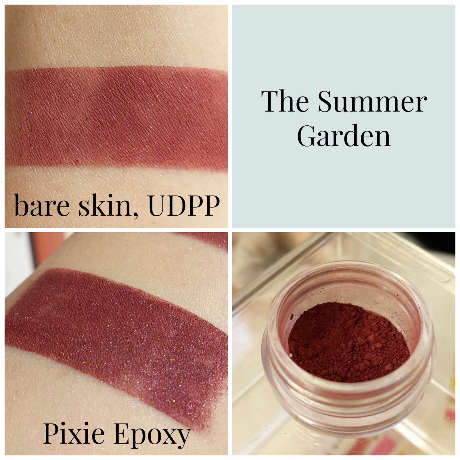
The Summer Garden: "a midtoned rosy purple", inspired by The Summer Garden and the Winter Garden

I had some issues with patchiness overall with this shadow, and it was fairly sheer over bare skin. Over bare skin and primer, I'd call this shadow a burgundy, but over Pixie Epoxy, the purple shows through.


Bluebeard: "a velvety navy blue", inspired by Bluebeard

This shadow was sheer over bare skin, but improves over primer. Over Pixie Epoxy, this shadow is by far the most gorgeous blue I've ever seen in a shadow. When I was working on taking my pictures, my fiance looked over and had me walk over to show him the swatch. That's a big deal, guys. The Epoxy picture really speaks for itself. This is wicked pigmented, and for me, this is the standout shadow of the collection. I never thought I'd like a blue shadow the way I do this one. If this shadow was a person, I'd marry them. (Sorry, Charles..)


Three Ravens: "a satiny black with strong blue undertones", inspired by The Three Ravens

This shadow has some pigmentation issues over bare skin and primer, but it's a deep blue-black over Pixie Epoxy. There are some subtle white sparkles scattered throughout.

Phew! This wraps up my review of the Kinder-und Hausmarchen Collection from Corvus Cosmetics. As I said, this post was long overdue! I'm so glad I picked up this collection, and I'd recommend it to anyone looking to add to their stash. My next post will be a comparison between Performance Colors' Zombie Bride Lipstick and Fyrinnae's Wizardry Liquid Lipstick. Stay tuned!

Mar 16, 2015

Swatches and Reviews of my First Femme Fatale Products

Aaaah, I could hear the angels singing. A light shone down from Heaven above, and down descended my little bag of Femme Fatale goodies. I recently participated in a Galentine's Day Exchange on /r/CatsandCosmetics, and along with oodles of other indies, I received these items from Femme Fatale. I was ecstatic! This review consists of three shadows and two blushes, and I'm so excited to show them off. Femme Fatale's mini jars have been restocked, so if for some crazy reason you haven't yet delved into the goodness that is Femme Fatale, do yourself a favor and place an order.


As per usual, swatches of shadows are over bare skin on the left and Fyrinnae Pixie Epoxy on the right. Blush swatches are over bare skin. All quoted product descriptions are taken directly from Femme Fatale's recently revamped site, which can be found here.


Fierce (recently renamed Rosewine, blush): "a deep maroon-tinted duochrome blush, with subtle plum undertones"

This blush is a gorgeous, pigmented reddish plum, but I have to personally build up the color otherwise it looks a little bruise-y on my skin. I know dead chic is in, but I don't think beat-up chic is in.. yet. Fierce/Rosewine is luckily, very easily to build up. The texture of the powder is very soft and easy to work with. It plays well with my brushes.


The Nightmare: "an eggplant purple base with intense golden green glimmers and sparkles"

The site photos for Femme Fatale's duochromes always look so dramatic and too good to be true. The Nightmare REALLY impressed. I tried my best to show the shift between the deep purple base and bright green shift, but I really don't think I could do it much justice. When the light hit this shadow, it transformed into a glowing green. This might be the first indie product to make me gasp a little. The Nightmare is pure sorcery.


Fire Bloom (blush): "a mid tone rose pink blush with coral undertones and a flattering copper gold shimmer"

The copper gold shimmer is really apparent in the jar, but once you blend your blush, it disappears. That's my only complaint about this one. The color is a touch more sheer than Fierce/Rosewine, so it took more product to get the pigmentation of the swatch you see here. I don't really think that's a bad thing, though; this blush can be used for a beautifully subtle rosy glow.


Darkmist: "a deep toned brown base with intense violet blue shimmer and teal sparkles"

Though this shadow doesn't have any shift to it, it glows in a similar way to The Nightmare. I think it's the contrast between the bright teal sparkles and dark base that make it appear to shine the way it does. All science aside, it's pretty magical. The deep brown base only showed when I swatched over bare skin. Out of all the products from Femme Fatale I received, this shadow needed a sticky base the most, and even then I could see little sparkles escaping when I swatched over the Pixie Epoxy.


Dispersion: "a deep mulberry with a bold teal blue shimmer"

The description is dead on. The deep mulberry base lights up with bright teal and blue when the light hits it. If you're pining for a shadow like this, I'd give Aromaleigh's Lucky Cat Emporium a try.

Well, that wraps up my post for today! As I said at the start of my post, I received oodles of indie goodies through the exchange, so I have a LOT more to share with you guys. My next post will be centered around Fyrinnae. I'm so excited to write about their plush shadows and neon blushes. Stay tuned!

Feb 16, 2015

Aromaleigh Swatches and Reviews

Disclaimer: I am currently in the process of reswatching duochromes and photographing them differently to give my readers a more accurate depiction of the shifts. Please be patient while I go through the process of updating my past reviews. :)

Happy Monday, everyone! Today I'm going to be reviewing my latest purchase from Aromaleigh Cosmetics. Aromaleigh was founded in 1998 (wow!) and their company has a lot to offer an indie newcomer or veteran. The company offers products ranging from shadows to blushes to finishing powders and primers. With collections inspired by neurodiversity, Ancient Rome, Blade Runner, and Sherlock, Aromaleigh has a little something for everyone.

Alright! Onto my swatches and reviews! All pictures are taken by me, and all quoted descriptions are taken directly from Aromaleigh's site. Swatches are bare skin on the left, and Fyrinnae Pixie Epoxy on the right.


Marguerite: "a rosy buff pearl frost with sparks of gold"

This is such a gorgeous frosty peach. A little hint of flush and a soft shimmer. Perfect for a one-shadow eye look or easily incorporated into softer looks.


Pyroclastic Flow: "a warm rose with a copper duo chrome highlight, and golden sparkles"

This is Marguerite's pinker cousin. I'm not able to pick up the copper highlight, so this reminds me of Hello Waffle's Purr-ide and Purr-ejudice quite a bit.


Hesperides: "a plush terracotta shade with a strong golden to chartreuse color traveling duochrome"

On Aromaleigh's site, this shadow is a gorgeous autumny orange-yellow with a strong golden shift. However, for me this is falling flat as a dull semi-matte terracotta. I'm suspicious this may be from a bad batch, as it looks like this shadow is just the base. It's lacking the dramatic shift entirely.


Lucky Cat Emporium: "a smooth cinnabar frost with bright shades of jade green"

This is such a funky shade, and I love it. A rusty red with bright jade sparkles. I don't know if any other indie company makes a shade like this! The contrast between the warm base and the cool sparkles is so unexpected, yet it seems like they were meant to be.


Experimental Drug: "a rich warm reddish brown with cool silvery iridescence of green, blue and violet"

This is another color that captures the beauty of contrast. From some angles, this shadow is an earthy red-brown, but in the light it transforms into a reddish lavender with a shimmer of cool hues.


Pool: "a rich greyed neutral blue matte"

I really wanted to love Pool after being disappointed by Beauty for the Win's Okay, but this shadow is patch city. The hunt for a periwinkle matte shadow continues.


Faunus: "a soft mossy green with gold tones, and interference shimmers of blue and violet"

Mermaids, rejoice! This is the shadow for you! My picture does the shadow no justice. In sunlight, it's a soft turquoise with a shift of gold and subtle blue and violet sparks. This shadow is definitely made from mermaid scales.


Destiny: "a frost finish in a rich deep neutral forest green shade"

Let's be honest: I bought this because my name is Destiny. Anyway.. this is a frosty neutral green that almost borders on metallic for me. I love using this as an outer v shadow with Faunus as the base.


Et Tu, Brute?: "a rich Tyrian purple with red duochrome and shards of red sparks"

Even in the pictures on Aromaleigh's site, this shadow has no red shift or sparks. I wish it could be a little.. bloodier looking. (I was stage manager for a production of Julius Caesar, and the front row of seats were labeled the "splash zone".) Despite the lack of red, this is a pretty lavender with a slight pink shift when the light hits it just right.


Walpurgisnacht: "a deep blue which shifts to violet due to it's strong reddish/violet duochrome. It also has fiery copper sparks!"

Fans of Madoka Magica, you know what's up. Walpurgisnacht is a dusty grey periwinkle with subtle copper sparks. I love blending this shadow into my crease for.. witchier looks. ;) (If you haven't watched Madoka Magica, please do.)

Despite a few shadows not matching up with site photos or descriptions, I'm pretty pleased with my little haul! Check out Aromaleigh's website here.

Jan 22, 2015

My First AFK Cosmetics Haul: Swatches

Disclaimer: I am currently in the process of reswatching duochromes and photographing them differently to give my readers a more accurate depiction of the shifts. Please be patient while I go through the process of updating my past reviews. :)

Ask and you shall receive, readers! After my First Impressions post, I had a lot of requests to show off my shinies in swatch form. I just received my first Fyrinnae Pixie Epoxy, so what better way to try it out than make this post? This is my first time taking pictures of swatches, so let me know if there's anything I can improve on!


Top Row: Alpha and Omega, Suicidal Bastard, You Smell Like Burning!, Tide Caller
Bottom Row: Mikasa, Silent Night, That Tastes Like Purple!, Fear Me

All swatches are bare skin on the left, and Fyrinnae Pixie Epoxy on the right.
As with a lot of sparkly indie shadows, they lose a lot of pigmentation and glitter without a good sticky base.


I really don't have a single complaint about any of these shadows. They all have a buttery or velvety texture, and the glittery shadows really stand out. Out of all eight, That Tastes Like Purple!, Mikasa, and Alpha and Omega and my favorites. That Tastes Like Purple! is an amazing lavender glitterbomb, Mikasa is very pigmented with and without a shadow base, and Alpha and Omega is a unique blue with red sparkle. As with most shadows, indie or not, the mattes tend to have some fallout during application despite using a sticky base. I always start with my eyes when I apply makeup, so it's nothing a tissue can't fix!

All in all, I would highly recommend AFK Cosmetics to any indie lover, especially fans of Attack on Titan and League of Legends, as most of AFK's shadows are based on those two amazing fandoms. If you're a Pokemon fan, be sure to snag Alpha and Omega before it disappears at the end of January! You can check out everything AFK Cosmetics has to offer at their website here.