Showing posts with label shadows. Show all posts

May 2, 2015

Salivating a Tad over Corvus Cosmetics' Kinder-und Hausmarchen Collection

Disclaimer: I am currently in the process of reswatching duochromes and photographing them differently to give my readers a more accurate depiction of the shifts. Please be patient while I go through the process of updating my past reviews. :)

This post is long overdue! After opening last year, Corvus Cosmetics has continued to impress with wonderfully themed collections and stunning shadows. Noel's upcoming projects include a mermaid-based shadow collection, and a line of lipsticks inspired by poisonous flora. I'm always excited to see what Noel has up her sleeve, because she's yet to disappoint for me.

I was quick to snap up the Kinder-und Hausmarchen collection right at release, and it's probably my favorite indie purchase I've ever made. Every color is excellent, and it's been driving me to start using challenging colors (blue shadow, eek!). As usual, Corvus shadows are very impressive over bare skin. There were a few shadows that weren't quite as pigmented over bare skin as I'm used to with Corvus, but if that's my only complaint, I'm a happy camper. This collection is inspired by tales by the Brothers Grimm. Noel includes summaries of each story on every shadow page, which I think is an awesome touch.


I've got a lovely bunch of eyeshadows, all sitting in their rows
(I watched The Lion King a few days back, can't get the songs out of my head)

As per usual, swatches are taken over bare skin, Urban Decay Eyeshadow Primer Potion, and Fyrinnae Pixie Epoxy. All quoted descriptions are taken directly off the Corvus Cosmetics' site, which you can visit following this link.


Barely a Bite: "an apple red with a poisonous green shift", inspired by Little Snow White

Oh lord, this shift is wicked.  A gorgeous warm apple red over bare skin and UDPP, but over Pixie Epoxy, the green shift seriously stands out. Honestly, if you told me this was a Femme Fatale shadow, I wouldn't question you.


Gingerbread Haus: "a matte tan with a complex indigo-purple-red shift", inspired by Hansel and Gretel

I love this shadow, but it's a bit of a contradiction. The shift and sparkle show up best over Pixie Epoxy, but shadows with matte bases don't always behave well over a glitter adhesive. It's a total glitterbomb, so I'm at a crossroads with this shadow. I think, in the end, it'll make me a master at applying Pixie Epoxy. This shadow is a beautiful matte gingerbread-brown over bare skin and UDPP, and I'll likely use it that way as a crease shade. If you can get your Pixie Epoxy application down, this shadow is dramatic and chock-full of purple sparkle over it. I'm such a sucker for shadows with contrasting sparkle like this!


The Devil Told You That: "a soft white highlight sheen with a gold sheen", inspired by Rumpelstiltskin

Normally white shadows don't impress me.. because, you know, they're white. This shadow really impressed me though, because I've found a lot of white shadows tend to be a bit chalky in their consistency. This had the same satin-y feel as the other shadows in the collection, and although it's a semi-sheer highlight over bare skin and primer, it's very pigmented and has an oh-so-subtle gold sheen over Pixie Epoxy. Since it's inspired by Rumpelstiltskin, obligatory Once Upon a Time reference:


The Thirteenth Gift: "a coral pink with a gold shift", inspired by Briar Rose (previously Why Not Zoidberg?)

If you forced me to pick a favorite from this collection, The Thirteenth Gift would be my favorite wearable shadow (my true favorite is Bluebeard). Over bare skin, it's a feminine coral-tinged pink. The gold shift shows up over both primer and epoxy, but the sparkles are more prominent over a glitter base (duh). This shadow is very versatile and the shift is stunning.


Death at His Feet: "a dark chocolate brown with a satin finish", inspired by The Godfather (previously Fine Jamaicon Bacon)

This is a deep chocolate shadow with subtle brown sparks. I had some issues with patchiness over bare skin, but it smoothed out over primer. For some reason, my camera was just not having taking pictures of my Epoxy swatch. Well, now you have a good idea of the sparkle!


Golden Slipper: "a champagne gold with a slight shimmer", inspired by Cinderella (previously Champaggin)

This shadow is a very intimidating mustard yellow in the jar, but it applies a soft, vintage gold with a touch of silver sparkle. This goes great paired with my neutrals, and is beautifully pigmented over bare skin, primer, and glitter base.


He Was No Frog: "a pastel blue-green with a gold shift", inspired by The Frog King (previously Good News Everyone)

Out of all the shadows from the collection, this one is the one I like the least. Almost nonexistent over bare skin, fairly sheer over primer, and a little chalky over Pixie Epoxy. The gold shift was very subtle. I feel like this shadow doesn't really live up to the standards of Corvus, and it could benefit greatly from some formula tweaking. It's a great color, but it has pigmentation and consistency issues for sure. (Noel just let me know that this shadow will be tweaked soon, along with Thirteenth Gift and her other pastel-based shadows! Yay!)


Nightingale: "a mid-toned aubergine with a subtle shimmer", inspired by The Nightingale and the Blindworm

I am such a sucker for purples, and luckily, this isn't a kind of purple I had in my collection yet. It's an eggplant purple with a touch of purple and pink shimmer. The consistency of Nightingale was plush and velvety. A must-have for the purple-obsessed!


Let Down Your Hair: "a soft nude-pink with lots of shimmer", inspired by Rapunzel (previously Smizmar)

This is my new favorite nude. A slightly rosy nude with an insane amount of glitter, Let Down Your Hair is a beautiful shadow. It can pair with just about anything.


The Better to Eat You With: "an antique silver with deep brown undertones", inspired by Little Red Cap (previously Bite My Shiny Metal @$&!)

I'm so, so glad this shadow made it into this collection. An unassuming brown over bare skin, with a hint of silver over primer, and then BAM! Over Pixie Epoxy, this shadow is an explosion of silver glitter. I mean, it's a ridiculous amount of glitter. I love it.


Goodbye Hans: "a bright orange with gold shimmer", inspired by Clever Hans (previously Orange Joe)

If you aren't familiar with the story of Clever Hans, please follow this link to read Noel's excellent summary. Then come back here. ...you done? Yeah, Hans isn't clever. He's frankly a bit of a dumbass. Whenever you think you have relationship problems, remind yourself that Hans threw eyeballs at his fiance. Anyway, this shadow is a pigmented, bright orange with gold sparks. 


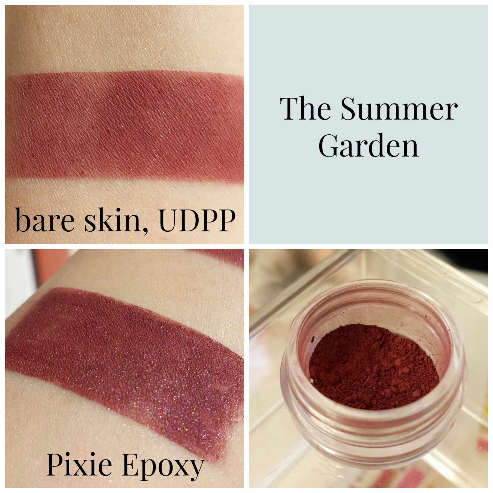
The Summer Garden: "a midtoned rosy purple", inspired by The Summer Garden and the Winter Garden

I had some issues with patchiness overall with this shadow, and it was fairly sheer over bare skin. Over bare skin and primer, I'd call this shadow a burgundy, but over Pixie Epoxy, the purple shows through.


Bluebeard: "a velvety navy blue", inspired by Bluebeard

This shadow was sheer over bare skin, but improves over primer. Over Pixie Epoxy, this shadow is by far the most gorgeous blue I've ever seen in a shadow. When I was working on taking my pictures, my fiance looked over and had me walk over to show him the swatch. That's a big deal, guys. The Epoxy picture really speaks for itself. This is wicked pigmented, and for me, this is the standout shadow of the collection. I never thought I'd like a blue shadow the way I do this one. If this shadow was a person, I'd marry them. (Sorry, Charles..)


Three Ravens: "a satiny black with strong blue undertones", inspired by The Three Ravens

This shadow has some pigmentation issues over bare skin and primer, but it's a deep blue-black over Pixie Epoxy. There are some subtle white sparkles scattered throughout.

Phew! This wraps up my review of the Kinder-und Hausmarchen Collection from Corvus Cosmetics. As I said, this post was long overdue! I'm so glad I picked up this collection, and I'd recommend it to anyone looking to add to their stash. My next post will be a comparison between Performance Colors' Zombie Bride Lipstick and Fyrinnae's Wizardry Liquid Lipstick. Stay tuned!

Apr 19, 2015

Checking Out Mad Lab Cosmetics!

I never see any love for Catherine's indie company, Mad Lab Cosmetics, so I thought I'd place an order myself and share my haul with you! I talked to Catherine a bit through Etsy, and she's super sweet. I purchased a full size Blogger Pack, and poured my sample baggies into my handy 3 gram jars.

My initial review was one of disappointment, and after posting this review, a lot of lovely ladies on IMAM told me there were better ways for me to apply my duochromes for swatches. So I did some fancy reswatches, and my opinion of this company has done a 180. These are really great shadows, and I'm so sorry that my poor application led to a misleading review. For those who want to know the magic ways of applying duochromes: Use a flat, dense-bristled brush, and pat the shadows on. If you're going to take pictures, take them from an angle!


L-R, T-B: Astral Radiance, Random Acts of Makeup, Blush Gold, Pink Opal
Labradorite, Sea Witch, Rhodium

All swatches are taken over, from left to right, bare skin, Urban Decay Eyeshadow Primer Potion, and Fyrinnae Pixie Epoxy. All quoted descriptions are taken directly off the Mad Lab shop page on Etsy, which can be found here!


Astral Radiance: "a light dusty rose with a matte finish and an overlay of purple and blue iridescence"

Such a gorgeous shift! A semi-matte dusty rose base with a subtle blue/purple highlight.


Random Acts of Makeup: "an ultra-rich rosy-bronze taupe that shifts purple under certain lights, all topped with a shimmery finish"

I love this color. An opaque rosy taupe with a little bit of bronze and a little bit of purple. Depends on the lighting. A shimmery finish.


Blush Gold: "a delicate peach with a gold shift"

A soft, feminine peach that shifts into a bold, metallic gold.


Pink Opal: "a translucent whisper pinky-cream that transforms into a bright purple fire with green sparkle"

A pink-toned cream color with silver sparks. Not picking up the purple or green, myself.


Labradorite: "an ethereal shot of teal iridescence over a pitch black base; matte with shimmer over bare skin, blossoms into shimmering duochrome over a sticky base or when applied wet"

Holy glowing duochrome, Batman! Bright turquoise over a pure black, and a beautiful glowing effect over Pixie Epoxy.


Sea Witch: "a pitch-black with a haunting purple glow"

Over bare skin and primer, the black base is very much there. However, over Pixie Epoxy, the whole shadow turns purple. Very much worthy of the Sea Witch herself!


Rhodium: "a blindingly pure white, with a shimmering metallic finish"

The shadow has a chalky consistency, and Catherine informed me it's because this shadow has a matte base. Even so, the other matte-based shadows I swatched didn't have this issue. This is a super pigmented and bright white, and the metallic finish is very subtle.

Welp, that wraps up my review of Mad Lab! I feel so embarrassed about my initial review, which really put Mad Lab in a bad light in terms of product quality. After trying a new application technique, I'm very impressed with these shadows. It's crazy what a different brush can do!

My next review will tackle ColourPop's notorious lip products. Stay tuned!

Apr 4, 2015

Checking Out Dark Matter's Stardust Shadows and Gravity Primer

Disclaimer: I am currently in the process of reswatching duochromes and photographing them differently to give my readers a more accurate depiction of the shifts. Please be patient while I go through the process of updating my past reviews. :)

Hey, guys! I took a bit of a break last week after a bout of writers' block, but now I'm back! Today I'm going to swatch and review four Stardust shadows from Dark Matter, as well as put their new(ish) Gravity primer to the test. Dark Matter opened in 2012, and came to light in IMAM last year. This is my first order from Dark Matter, but I'd been eyeing the company for a while. From a collection honoring badass female contributors to the world of science, to adorable star shaped swatches, I've been impressed.

When Dom released the Gravity Eyeshadow Primer, I finally bit the bullet and placed my order. My purchase was for three eyeshadow samples, and came with an additional shadow sample and a clamshell sample of the Gravity Primer. Keep in mind non-GWP shadow samples come in "test tubes". Such a cute name, and the tubes hold true to the science theme of Dark Matter, but they're very skinny and my brush couldn't fit in them. For my review today, I poured a tiny bit onto a business card and used them from there. When my shipment of jars arrives, I'll be depotting these. Sometimes theming needs to take a backseat to practicality.


L-R: Aries, Virgo, Aquarius, Betelgeuse, Gravity Eyeshadow Primer

Because I'm reviewing Dark Matter's Gravity Primer, my swatches are going to be a little different. From left to right and top to bottom, shadows will be swatched over bare skin, Urban Decay Eyeshadow Primer Potion, Fyrinnae Pixie Epoxy, and Dark Matter's Gravity Eyeshadow Primer. As usual, all quoted descriptions are taken off Dark Matter's Etsy shop page, which you can check out here!


The elusive Gravity Primer in its natural habitat..

Let's start off with my first impression of Gravity, Dark Matter's primer. Gravity was advertised as part primer, part glitter glue. I'd say this is definitely a bit of both. It's a milky white both in the clamshell and on my skin, and stays tacky on your skin after applying. The consistency feels somewhere between Pixie Epoxy and e.l.f. Glitter Glue. I've yet to give this a test run, but I'll report back when I do! So far I feel like I haven't quite mastered the application yet. Onto the shadows!


Aries: "a light metallic gold with gold sparks"

This was a pale metallic dandelion yellow with gold sparks. It didn't hold up too well over bare skin, but looked nice over my primers. I think it performed the best over Pixie Epoxy, but I also think I went too heavy on the Gravity primer. A little goes a looong way, and I didn't realize it.


Virgo: "a light pink that has a golden duochrome"

This shadow leaned lilac on bare skin and UDPP, but was true to description over Pixie Epoxy and Gravity. This is a really delicate shade, and I'll be pairing it with brighter pinks and rose golds for Spring.


Aquarius: "a duochrome that shifts from a dark, yet pure blue to a metallic gold"

I was really impressed with the pigmentation over bare skin here. I wouldn't consider this to be a duochrome, however. Over primers, the shadow definitely transforms, but the color doesn't shift depending on the angle you look at it or the light hitting it. For me, the blue doesn't change to a metallic gold, but rather an antiqued green-gold. It isn't very true to the description, but I still like it.


Betelgeuse: "a chocolate burgundy base under an extreme flash of gold glittering highlight"

This actually ended up being my favorite of the bunch! This is a shadow that has the "glowing from within effect" that I love so much. The antique gold really pops over the dark base. I think the glowing effect is lost a bit over Gravity Primer.

Overall, I was pretty impressed with my order. The Stardusts are very pigmented over bare skin, and they look so beautiful over Pixie Epoxy and Gravity. I can't wait to try Aquarius and Betelgeuse as liners! Gravity is a great option for those who don't want to pick between a primer or a glitter glue. But since it's a bit of both, don't expect it to make your shadows pop like Pixie Epoxy does. In terms of learning how to apply it, I'd say it has the same learning curve as Pixie Epoxy. I also think that because of its color, it might not look quite right on someone with darker skin that me. I'm glad I was sent a sample of Gravity, but since I already have a primer and glitter glue I love, I likely won't be purchasing a full size unless it performs wonderfully on my oil slick eyelids.

Well, that wraps up my review! I'd definitely recommend Dark Matter to any indie lover. Dom definitely didn't disappoint, and I'm excited to see what she comes up with next!

<a href="http://www.bloglovin.com/blog/13553453/?claim=q7aqenwmaea">Follow my blog with Bloglovin</a>

Mar 17, 2015

The Great Battle of Shadow Over Primer!

I saw a lot of discussion today on IMAM about how shadows should perform decently on bare skin and over regular primer, but some don't. I thought it'd be interesting to see how the brands I own fare over bare skin, UDPP, and Fyrinnae Pixie Epoxy, and how much I'm paying for each shadow. Five hours and six episodes of Neon Genesis Evangelion later, I present to you: The Great Battle of Shadow Over Primer! Don't critique the name, man. It's four in the morning and I'm a little loopy from being tired. Just roll with it.

Swatches are taken, from left to right, over bare skin, Urban Decay Eyeshadow Primer Potion, and Fyrinnae Pixie Epoxy. Dollar amounts are in USD, and by teaspoon unless the brand measures product by gram. There won't be much commentary in this post, because the pictures pretty much say it all.


So the cheapest shadow by tsp is Brija Cosmetics, and the most expensive by tsp is Daily Lovelies. I thought that was interesting because I prefer Brija over Daily Lovelies any day. A lot of these shadows were pretty sheer over bare skin, regardless of price. Corvus shadows totally dominated over bare skin. Noel's always been pretty proud of the way her shadows look over bare skin, and she has every right to be. It's also interesting to note that her shadows are one of the cheapest of the bunch.

Well, I hope this was informative for you guys! I definitely got a kick out of swatching all these, and it'll lead to smarter purchases in the future. My next post will either be a tutorial on how to use Fyrinnae Pixie Epoxy or how to apply pigmented blushes.. or maybe I'll combine both into one post! Stay tuned!

Mar 16, 2015

Swatches and Reviews of my First Femme Fatale Products

Aaaah, I could hear the angels singing. A light shone down from Heaven above, and down descended my little bag of Femme Fatale goodies. I recently participated in a Galentine's Day Exchange on /r/CatsandCosmetics, and along with oodles of other indies, I received these items from Femme Fatale. I was ecstatic! This review consists of three shadows and two blushes, and I'm so excited to show them off. Femme Fatale's mini jars have been restocked, so if for some crazy reason you haven't yet delved into the goodness that is Femme Fatale, do yourself a favor and place an order.


As per usual, swatches of shadows are over bare skin on the left and Fyrinnae Pixie Epoxy on the right. Blush swatches are over bare skin. All quoted product descriptions are taken directly from Femme Fatale's recently revamped site, which can be found here.


Fierce (recently renamed Rosewine, blush): "a deep maroon-tinted duochrome blush, with subtle plum undertones"

This blush is a gorgeous, pigmented reddish plum, but I have to personally build up the color otherwise it looks a little bruise-y on my skin. I know dead chic is in, but I don't think beat-up chic is in.. yet. Fierce/Rosewine is luckily, very easily to build up. The texture of the powder is very soft and easy to work with. It plays well with my brushes.


The Nightmare: "an eggplant purple base with intense golden green glimmers and sparkles"

The site photos for Femme Fatale's duochromes always look so dramatic and too good to be true. The Nightmare REALLY impressed. I tried my best to show the shift between the deep purple base and bright green shift, but I really don't think I could do it much justice. When the light hit this shadow, it transformed into a glowing green. This might be the first indie product to make me gasp a little. The Nightmare is pure sorcery.


Fire Bloom (blush): "a mid tone rose pink blush with coral undertones and a flattering copper gold shimmer"

The copper gold shimmer is really apparent in the jar, but once you blend your blush, it disappears. That's my only complaint about this one. The color is a touch more sheer than Fierce/Rosewine, so it took more product to get the pigmentation of the swatch you see here. I don't really think that's a bad thing, though; this blush can be used for a beautifully subtle rosy glow.


Darkmist: "a deep toned brown base with intense violet blue shimmer and teal sparkles"

Though this shadow doesn't have any shift to it, it glows in a similar way to The Nightmare. I think it's the contrast between the bright teal sparkles and dark base that make it appear to shine the way it does. All science aside, it's pretty magical. The deep brown base only showed when I swatched over bare skin. Out of all the products from Femme Fatale I received, this shadow needed a sticky base the most, and even then I could see little sparkles escaping when I swatched over the Pixie Epoxy.


Dispersion: "a deep mulberry with a bold teal blue shimmer"

The description is dead on. The deep mulberry base lights up with bright teal and blue when the light hits it. If you're pining for a shadow like this, I'd give Aromaleigh's Lucky Cat Emporium a try.

Well, that wraps up my post for today! As I said at the start of my post, I received oodles of indie goodies through the exchange, so I have a LOT more to share with you guys. My next post will be centered around Fyrinnae. I'm so excited to write about their plush shadows and neon blushes. Stay tuned!