Jun 21, 2015

Let's Check Out Two Different Shiro Alpaca Picnic Glosses!

Hey there, party people! Today's my birthday, and what better way to celebrate than to write a blog post? (No, seriously, I'm a dork and I'm really enjoying this.)

I made a custom gloss purchase from Shiro last month, and something went awry. I ordered a custom Alpaca Picnic gloss in moderate opacity, and I was sent one that was sheer (something something sheer-o joke). I emailed Caitlin with a few swatch pictures to show what was up, and she quickly replied with an apology and a few solutions to pick from. I decided to reorder another gloss in moderate opacity, because I love Animal Crossing, so I gotta slather this all over my lips. Well.. I was sent a gloss that's opaque, but when life gives you an insane metallic gloss, sometimes you just learn to rock it. I know if I emailed Caitlin again, she would be just as awesome as she was the first time and offer me a refund, store credit, or a new gloss.. but lately, I've been working on stepping out of my comfort zone, so moderate schmoderate! Plus, having an Alpaca Picnic gloss of every opacity would be a little crazy.

Since I have the lovely opportunity to showcase both sheer and opaque opacities, why not? So today I did swatches of both to show the differences. The sheer gloss was purchased in full by me, and the opaque gloss was sent as a replacement, free of charge, from Shiro. All opinions are my own, and all swatches are taken over moisturized and exfoliated lips.


Alright, here's the packing for both! I noticed the top of the sheer gloss is black and the opaque gloss is a metallic-y brown. Not sure if that means anything. Normally custom glosses come with a handwritten label, but since I'm such an Animal Crossing fan, I requested the Alpaca Picnic label art to replace the usual label. The sheer gloss looks fairly thin in the tube, and appears a little darker than the opaque gloss. Shown on the doefoot applicators, the opaque gloss is darker, far more metallic, and has the consistency of a liquid lipstick. Product sticks to the wand, whereas with the sheer gloss, the product slides right off.


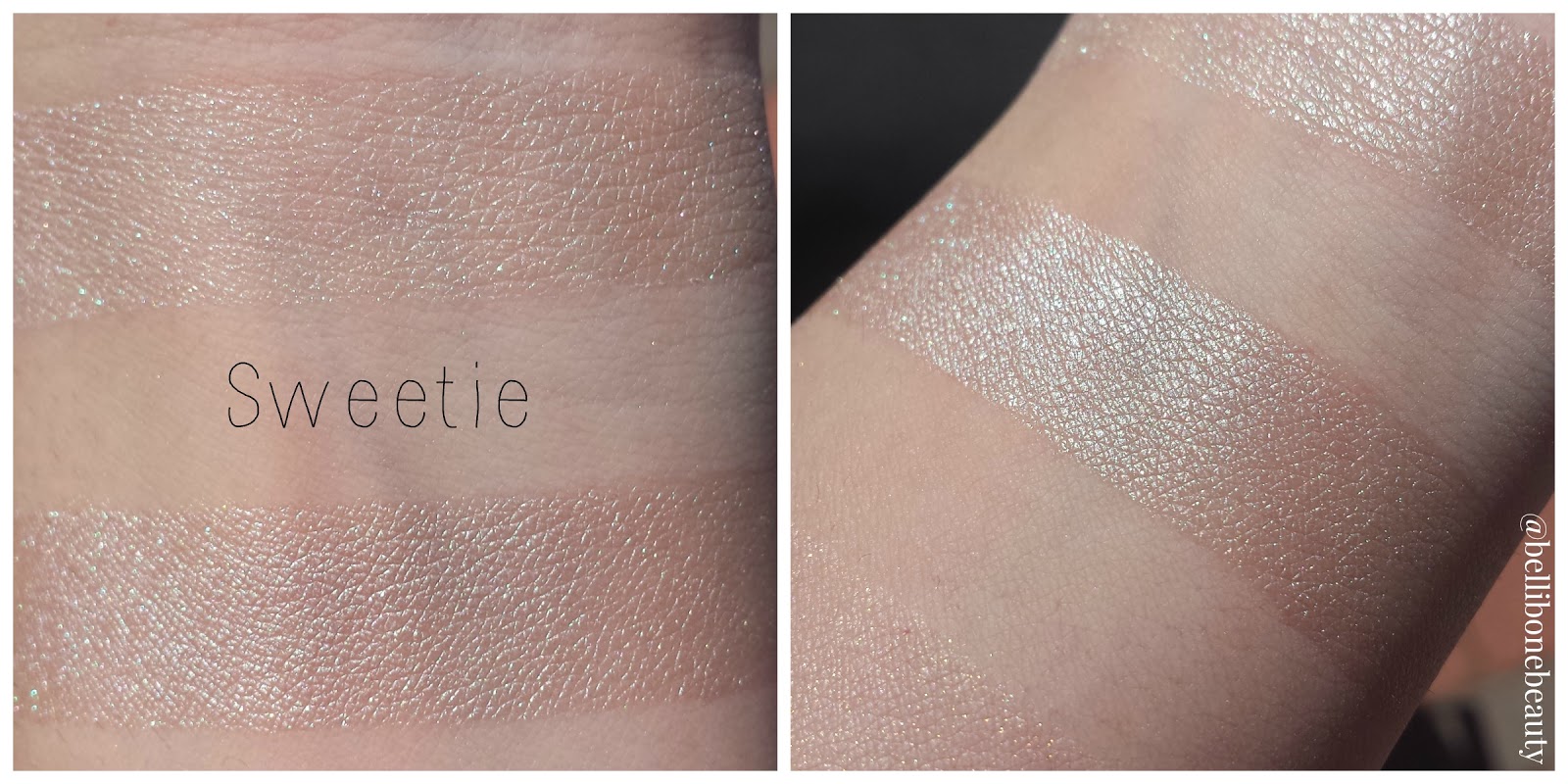
For the arm swatches, I scraped any excess product off the doefoot before swatching the top row. For the bottom row, I slathered it on to give a better idea of how the gloss could be built up if desired.

Alright, let's start with the sheer! I think it's easy to see why I emailed Caitlin. It doesn't really add much color at all. It may as well be a clear gloss with a bit of pink glitter. I don't think the metallic nature of this shadow lends well to a sheer gloss.

The opaque gloss is ALL UP IN YOUR FACE with its brightness, and I love it. It's a Barbie hot pink with a strong metallic sheen. It's a liquid lipstick consistency, and I noticed that it had a tendency to ball up a bit around the edges. It's easy to fix, but I didn't see it until I was editing my pictures. Whoops! It was impossible to capture with my camera, but it looks like molten pink metal. It's fabulous, but I wouldn't recommend it if you're wanting something for every day wear. This is a gloss for those days where you don't give a friggity frack what anyone thinks. You do you, babe. You do you.


Welp, that wraps up my post! I'm not sure what I'd do next, but I'm thinking I might do an eye look tutorial. I've been working on my blending and I'm feeling really confident in my skillz lately. Stay tuned!

Jun 15, 2015

[REDACTED]: A Smelly Yeti Review

Today my first ever Smelly Yeti order arrived, and it's basically everything I thought it would be and more. Smelly Yeti drew me in with its beautiful weirdness and has me hook, line and sinker with their scents. In terms of unique smells, I'd rank Smelly Yeti up there with Darling Clandestine. Let's check out what I got, shall we?


OH MY GOD A DINOSAUR THIS IS NOT THE TIME- ahem. I ordered a five-pack of samples, and in my package I found a nicely wrapped jewelry box for my samples, two dinosaur temporary tattoos, two Zotz, and a little plastic dinosaur friend. I was also one of the first fifty orders after Smelly Yeti's reopening, so I also received a bag of the not-yet-released Bubble and Soak to give a try. I already showered today (boo), so my usage review of the Bubble and Soak will come later. I opened the bag to check it out, and it has the texture of crumbly cookie dough and smells ah-mazing.

All products purchased by me, and all opinions are my own. Italicized perfume notes are taken directly from Smelly Yeti's website, found here.


NOT THE BEES: candied honey, honeysuckle, citrus, smooth vanilla

Smelling from the bottle: Sharp honeysuckle and citrus that quickly fades to creamy vanilla and sweet honey.

Applied on skin: Oh sweet lord, I finally found a honey perfume that doesn't turn plasticky on me. Creamy vanilla and sweet honey, with a tang of citrus and a hint of honeysuckle. Dries down to a sweet honey with soft vanilla.

Ouran: bulgarian roses, english roses, rosehip jasmine, pikake flower, yuzu, hint of tropical flavor

Smelling from the bottle: I've never been big on florals, so bear with me on the descriptions as I'm not familiar with flowery scents. This smells like sticking your nose in a big pink rose dampened with morning dew. It's a traditional rose that's very bold, but not overwhelming and surprisingly simple. (Like I said, bear with me.)

Applied on skin: Uh oh. After a few minutes, this turned very old lady, baby powdery floral on me. I'll use this in my hair and hope I get better results, because I really like how it smells in the bottle.

Paradisio: lilac, lillies, bright fruits, air, warm, pink flower, apple

Smelling from the bottle: This perfume has so many complex elements. I smell sweet lilies, warm air, apple, and.. general brightness, if that makes sense? I can't imagine a perfume better embodying the Garden of Eden. It's a bright, sunny day in a stunning garden of bright flowers and fruits. This is fantastic.

Applied on skin: Wow, this is Darling Clandestine Tilt-a-Whirl's fruitier, warmer cousin. Unlike Tilt-a-Whirl, though, this perfume doesn't mellow out on the dry down. The sweetness intensifies, and a slight crisp green apple emerges.

THE ILLUMINATI IS REAL AND YES I AM IN IT: blackcurrant scones, cinnamon, sugar, teacakes, raspberry jam

Smelling from the bottle: Powdery scones and crumbly cakes with a dash of sugar and a fleeting smell of raspberries and spice. This isn't nearly as potent as the other perfumes, but I appreciate its subtlety.

Applied on skin: The powdery, crumbly dough smell evens out and mingles nicely with raspberry jam and a toss of cinnamon. The dry down welcomes a syrupy blackcurrant sprinkled with sugar. This perfume fades fast as it's very delicate, so I'll use it in my hair.

We are as Gods: coconut, pineapple, cool whip, cream cheese, pecan, cherry, marshmallows

Smelling from bottle: Wow, I can smell every single note, seemingly all at once. When I bought this perfume, I thought the note list sounded a bit ambitious, but these notes mingle so well and it smells so natural. Crisp coconut, chilled pineapple, whipped cream, fresh cream cheese, woody pecan, tart cherries, and a handful of marshmallows. Woah.

Applied on skin: Mmmm, the cream cheese really pops on my skin, but it doesn't turn sour like a lot of dairy notes usually do (how I wish I could love you, HoG Milkmaid). The cherries are sweeter and the coconut toasted. Pecans crunched and the fluff of cool whip. My mouth is watering.

Alright, my arms are covered in dabs of perfume and I smell like a fruity, sugary, honey-coated goddess. I'm really happy with my sample choices and I'm super excited to try out the Bubble and Soak to let you all know what I think. Stay tuned!

Jun 8, 2015

Lipsticks This Good Should Be Ill-Eagle

I am so super excited to share my order from Preen Cosmetics with you! Preen is a brand-spanking new company operated by the lovely Jenn, and it currently consists of five lipsticks and three lip balms (with two more lipsticks on the way!). Since this is a new company, I'm going to take a lot more time in talking about the company and products.

Preen Cosmetics has a running bird theme, inspired by Jenn's love for ornithology. The aesthetic of the shop is beautiful, and the packaging is lush and feels very well thought out. My order came with two clamshell lipstick samples, and a Ghirardelli Caramel Chocolate square. Jenn knows the way to my heart.


Everything was just pristine. The business card is printed on linen, which has a luxurious feel to it. My products were wrapped in tissue paper and tied with a paper bow. It's very simple, but sweet. Inside the tissue paper was a ziploc closed and folded over with a Preen sticker, and inside were my lipstick tubes, my free samples, and the business card. Both tubes were closed tightly and secured with little strips of bird-printed washi tape. The clamshells weren't secured with tape, but they close very snugly and feel sturdy over all. The lipstick tubes are pretty light, but feel very substantial when opening and closing. Both twisting mechanisms turned smoothly.


More details on the packaging and the products inside! My Mourning Dove lipstick was a little smooshed in the tube, but these lipsticks are so creamy that one application smoothed it out just fine. As for the clamshells, I'd guess you could probably get about ten applications from each sample. The formula makes it easy to use a lip brush. No sticking these in your bra to warm them up! Overall, the lipstick formula is creamy, moisturizing, and holds up well. They're also very pigmented, and reach full opacity in one swipe. Frigatebird left a bit of a stain, but it would work well for those mornings where yesterdays' lip stain is todays' lip color. Alright, onto the swatches!

All products were purchased in full, and all opinions are my own. Quoted descriptions are taken directly off Preen's Etsy page, found here. Lip swatches are taken over exfoliated and moisturized lips.


Mourning Dove: "peachy-toned nude"

Oh lordy, I finally found my perfect nude. Not too pink, not *too* peach, but just right. I love this color on me because I can pair it with just about any makeup look and it'll fit right in. It has a semi-matte finish that reminds me of Kae Q's balms.


Rose Robin: "slightly neutral-leaning purple/pink with a little bit of shimmer"

This would make a great MLBB for those with pinker lips! It's a subtle pale lilac with a hint of shimmer to it. Rose Robin doesn't dry as matte as Mourning Dove.


Bullfinch: "orange-red with the slightest yellow sheen"

The site swatches make this look more true orange than it is. For me, it looks more like a metallic brick with a yellow sheen. This one doesn't dry down as much as the others, and smudges a little easier.


Frigatebird: "red as the day is long"

Damn, that's a sexy color description. This is a beautiful true red that may leave a bit of a stain. It dries the same as Rose Robin- somewhere between semi-matte and creamy.

Welp, that wraps up my review of Preen Cosmetics! I'm totally head over heels for this new brand, and I would definitely recommend it to anyone who hasn't taken the indie lipstick plunge yet. What kind of post would you like to see next? :)

Jun 7, 2015

Stickin' It to Society with Corvus Cosmetics' Westerburg Shadows!

Hey, everyone! This is my overdue swatch 'n' review of three Westerburg shadows, inspired by the cult 80's classic, Heathers. If you haven't watched it, it's on Netflix and I would recommend it.


All products purchased in full, and all opinions are my own. Quoted product descriptions are taken directly off the Corvus Cosmetics website, found here. Swatches are taken over bare skin and Urban Decay Eyeshadow Primer Potion on the top row, and Fyrinnae Pixie Epoxy on the bottom.


Is That Pâté?: "a slightly shimmery warmer-toned taupe"

This is a warm-toned taupe with a subtle spattering of silver and turquoise sparks. Noel included this as my free sample, and I'm really glad she did! It makes for a great crease color.


Moby Dick: "a shimmery neutral gray"

This is one of the few Corvus shadows I've tried that isn't as pigmented over bare skin, but it still applies evenly. A grey-toned taupe over bare skin and primer, but darkens to a shimmery grey over a glitter adhesive.


BS With a Body Count: "a gray toned blue-purple with a strong green shift"

Honestly, this is a muted version of Femme Fatale's The Nightmare, but I don't think that's a bad thing. It's a bit patchy over bare skin and primer, but it's a stunning metallic green over glitter adhesive. This shadow made me gasp when I swatched it.

Welp, that wraps up my post! I've been tossing around ideas for my next post, so let me know which one you'd like to see next: Highlighter comparisons, or a swatch post of shadows that all share the same color (all of my purples, blues, golds, etc)?

Jun 6, 2015

Let's Grieve Over Hello Waffle's Kitty Kingdom Collection

In the spirit of swatching all of my indies, I had to swatch my products from Hello Waffle's discontinued Kitty Kingdom collection. The collection debuted on Black Friday and had a small restock earlier this year, but now the Kingdom is officially gone. Sunday Swap on /r/Indiemakeupandmore is just around the corner though, so if you see something you like, you can always request it! To spare you all, I'm going to make my shadow descriptions brief. The formula of these products is nothing new to anyone who has tried Hello Waffle: the shadows are silky and apply best over a glitter adhesive. Some show up well over bare skin, some not. The blush is pigmented, but easy to blend.


All products were purchased in full, and all opinions are my own. Since Hello Waffle no longer carries these products, I don't have anywhere to pull official descriptions from. I'm winging it! Eyeshadow swatches are taken over bare skin and Urban Decay Eyeshadow Primer Potion on the top row, and Fyrinnae Pixie Epoxy on the bottom. Facial product swatches are applied heavily on the top row and blended out on the bottom.


Sweetie: a shimmery cream white highlight with a green shift and blue sparks


Furry Tummies: a near-matte apricot with subtle golden sheen


Double Trouble: a sheer salmon with light pink and gold sparks


Little One: a rosy pink with gold sparks throughout


Box Cat: a metallic bronze with striking gold shift


Chloe: a red based brown with bronze shimmer


Mm, Treats! (blush): a mulberry red that leans peachy pink when blended, subtle gold and silver sparks

That wraps up this post! My next swatch and review will be on three shadows from Corvus Cosmetics' Westerberg collection. Stay tuned. :)

Jun 3, 2015

Let's Check Out Some Hello Waffle Faves!

Hey, everyone! My Hello Waffle collection is fairly large, and I've been wanting to start swatching them all for you. So, for today, I'm going to swatch and review some shades I know a lot of people love. Next I'll tackle a good chunk of the discontinued Kitty Kingdom collection!


All products have been purchased in full and all opinions are my own. Facial product swatches are swatched heavily on the top row and blended out on the bottom. Eyeshadow swatches are taken over bare skin and Urban Decay Eyeshadow Primer Potion on the top row, and Fyrinnae Pixie Epoxy on the bottom. All quoted descriptions are taken directly from Hello Waffle, and their site can be found here.


Lavender Cream (highlighter): "Creamy white with lavender sheen"

It was so frustratingly impossible to capture the lavender shift of this highlighter. It's ethereal, and honestly, I feel like a beautiful fairy princess when I use Lavender Cream. The powder is very silky and blends down with ease. It has a lot of sparkle, but surprisingly little fallout.


Animate Chess-piece: "Pale dusty pink sheen with a touch of violet"

This is a dusty mauve with a pink sheen and subtle violet sparkle. I love how vibrant the shift is. Animate Chess-piece works best over a glitter adhesive, but doesn't look too shabby over a primer, either!


Purr-ride and Purr-rejudice: "Lady-like blush pink"

Not gonna lie, I bought this one for the label art. Who can resist a kitty in a sweet, pink dress? I hope to someday look as cute as that cat. Label art love aside, this is a beautiful blushy pink. It's very sheer over bare skin, and it's not much better over primer. This is one of those shadows where a glitter adhesive is the only real way to fly.


Ethereal Voice: "Warm purple with noticeable golden shimmer"

I think Ethereal Voice was a lot of people's first love with Hello Waffle. I really want to love it, but it's oh so patchy over bare skin and primer, and it took a lot of work to apply it evenly over Pixie Epoxy. Luckily, the Persinette Collection is being re-released on June 21st (MY BIRTHDAY), and it'll be completely reformulated. For reference, the new Greek Gods and Goddesses Collection from Hello Waffle sports the new formula, and it looks creamy and pigmented over bare skin. So, the new Persinette Collection is a princess worth waiting for.

You better believe I snuck a Tangled quote in here.

That wraps up my post about my most popular Hello Waffle products. I'm excited to swatch more of my Hello Waffle collection. I've been neglecting them lately, and they need some love. The woes of having too many eyeshadows! :P Stay tuned!

Jun 1, 2015

Let's Swatch All of My Femme Fatale!

Today was a lazy Sunday with plenty of sunshine, so I thought I'd update my swatch bank with all of my Femme Fatale goodies. I've reviewed most of the shades before, but I wasn't swatching and photographing my makeup as well back then. I thought it would be nice for a refresher!


All shadows were purchased at full price. All opinions are my own, and all quoted descriptions are taken directly from the Femme Fatale website, which can be found here. Shadow swatches are taken over bare skin and Urban Decay Eyeshadow Primer Potion on the top row, and Fyrinnae Pixie Epoxy on the bottom. Blush swatches are swatched heavily on the top row and blended out on the bottom.


Bone Dust: "a pale taupe with coppery pink shimmer and sparks"

This is a dusty grey/taupe with a subtle copper shift and pink sparks. Straight on, it leans more white than taupe.


Moonglow: "a pale columbia blue with a prominent golden duochrome and subtle pink shimmer"

Femme Fatale's swatch of this really showcases a gold shift, but I couldn't get it to show nearly as well. Nevertheless, it's definitely there, just not as prominent as I would expect.


Candied Apple: "a pale redwood pink with a green undertone, and blends out to have an almost brown undertone to it"

This is one of Femme Fatale's most popular shadow shades, and it's easy to understand why. Over bare skin and primer, this shadow is a rosy brown with green sparks, which makes it great for every day wear. But over a glitter adhesive, it glows green. I wore this as a one-shadow look last week, and my fiance kept complimenting it.


Bat Wing Hall: "a muted puce pink with purple undertones; when applied shifts to be more rosy. complimented with golden shimmers"

This is such a fantastic almost-nude shadow that can be used for a variety of looks. Over bare skin, it's a muted rosy pink, and over primer and glitter adhesive, the golden shimmers really start to pop. I love using this to darken my outer corner and as a crease shade.


Dispersion: "a rich mulberry base with strong aqua shimmer and sparkles. the aqua shifts to a pink/purple at an angle to the light"

Unfortunately, I had a difficult time capturing the rich aqua tones in this shadow. Femme Fatale recommends patting this shadow on rather than swiping (which is pretty standard with duochromes). Dispersion is a beautifully pigmented mulberry with a pink to purple to bright aqua shift. I had some issues with patchiness when applying this, but it wasn't anything a little patience couldn't smooth out.


Darkmist: "a deep red toned brown base with intense violet blue shimmer and teal sparkles"

This is a red toned violet with deep blue shimmer and teal sparks. This is one of the few shadows I own from Femme Fatale that doesn't have a shift to it, but it's beautiful regardless. Darkmist makes for some killer purple smokey eyes.


The Nightmare: "an eggplant purple with intense golden green shimmer and sparkles"

I am such a sucker for shadows that transform over glitter adhesives like The Nightmare does. This is a truly versatile shadow that applies as an cool-toned eggplant purple over bare skin and primer, and comes to life as a deep golden purple with green sparks over glitter adhesive. It's so difficult to describe the final color of this shadow. I feel like it could've easily turned out ruddy looking, but it really shines. If you don't own any shadows like this, I would recommend picking it up with your next purchase.


Fire Bloom (blush): "a mid tone rose pink with coral undertones and a flattering copper gold shimmer"

Fire Bloom is, in my opinion, a must have blush from Femme Fatale. It's a very flattering neutral pink with gold sparkle, but as you blend, the sparkles become more subtle. That's how I prefer my blushes- not too sparkly, but not quite matte. This fits the bill.

Welp, that wraps up the reswatching of my Femme Fatale products! I tried out a different way of laying out my swatch photos with this post. I'd love to hear your opinions on it! Feel free to leave a comment and tell me what you think. As always, I'm open to new ideas and ways I can improve Bellibone Beauty. Stay tuned!