Disclaimer: I am currently in the process of reswatching duochromes and photographing them differently to give my readers a more accurate depiction of the shifts. Please be patient while I go through the process of updating my past reviews. :)
This post is long overdue! After opening last year, Corvus Cosmetics has continued to impress with wonderfully themed collections and stunning shadows. Noel's upcoming projects include a mermaid-based shadow collection, and a line of lipsticks inspired by poisonous flora. I'm always excited to see what Noel has up her sleeve, because she's yet to disappoint for me.
I was quick to snap up the Kinder-und Hausmarchen collection right at release, and it's probably my favorite indie purchase I've ever made. Every color is excellent, and it's been driving me to start using challenging colors (blue shadow, eek!). As usual, Corvus shadows are very impressive over bare skin. There were a few shadows that weren't quite as pigmented over bare skin as I'm used to with Corvus, but if that's my only complaint, I'm a happy camper. This collection is inspired by tales by the Brothers Grimm. Noel includes summaries of each story on every shadow page, which I think is an awesome touch.




This post is long overdue! After opening last year, Corvus Cosmetics has continued to impress with wonderfully themed collections and stunning shadows. Noel's upcoming projects include a mermaid-based shadow collection, and a line of lipsticks inspired by poisonous flora. I'm always excited to see what Noel has up her sleeve, because she's yet to disappoint for me.
I was quick to snap up the Kinder-und Hausmarchen collection right at release, and it's probably my favorite indie purchase I've ever made. Every color is excellent, and it's been driving me to start using challenging colors (blue shadow, eek!). As usual, Corvus shadows are very impressive over bare skin. There were a few shadows that weren't quite as pigmented over bare skin as I'm used to with Corvus, but if that's my only complaint, I'm a happy camper. This collection is inspired by tales by the Brothers Grimm. Noel includes summaries of each story on every shadow page, which I think is an awesome touch.

I've got a lovely bunch of eyeshadows, all sitting in their rows
(I watched The Lion King a few days back, can't get the songs out of my head)
As per usual, swatches are taken over bare skin, Urban Decay Eyeshadow Primer Potion, and Fyrinnae Pixie Epoxy. All quoted descriptions are taken directly off the Corvus Cosmetics' site, which you can visit following this link.

Barely a Bite: "an apple red with a poisonous green shift", inspired by Little Snow White
Oh lord, this shift is wicked. A gorgeous warm apple red over bare skin and UDPP, but over Pixie Epoxy, the green shift seriously stands out. Honestly, if you told me this was a Femme Fatale shadow, I wouldn't question you.

Gingerbread Haus: "a matte tan with a complex indigo-purple-red shift", inspired by Hansel and Gretel
I love this shadow, but it's a bit of a contradiction. The shift and sparkle show up best over Pixie Epoxy, but shadows with matte bases don't always behave well over a glitter adhesive. It's a total glitterbomb, so I'm at a crossroads with this shadow. I think, in the end, it'll make me a master at applying Pixie Epoxy. This shadow is a beautiful matte gingerbread-brown over bare skin and UDPP, and I'll likely use it that way as a crease shade. If you can get your Pixie Epoxy application down, this shadow is dramatic and chock-full of purple sparkle over it. I'm such a sucker for shadows with contrasting sparkle like this!

The Devil Told You That: "a soft white highlight sheen with a gold sheen", inspired by Rumpelstiltskin
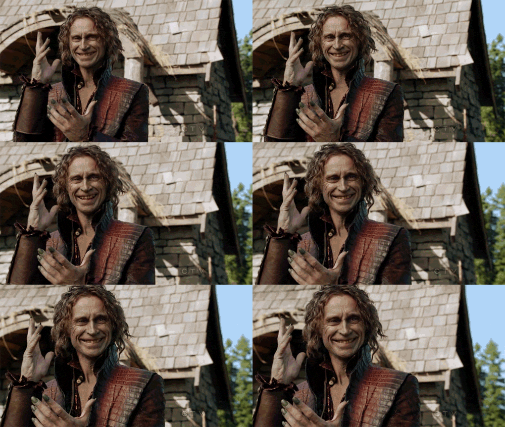
Normally white shadows don't impress me.. because, you know, they're white. This shadow really impressed me though, because I've found a lot of white shadows tend to be a bit chalky in their consistency. This had the same satin-y feel as the other shadows in the collection, and although it's a semi-sheer highlight over bare skin and primer, it's very pigmented and has an oh-so-subtle gold sheen over Pixie Epoxy. Since it's inspired by Rumpelstiltskin, obligatory Once Upon a Time reference:

The Thirteenth Gift: "a coral pink with a gold shift", inspired by Briar Rose (previously Why Not Zoidberg?)
If you forced me to pick a favorite from this collection, The Thirteenth Gift would be my favorite wearable shadow (my true favorite is Bluebeard). Over bare skin, it's a feminine coral-tinged pink. The gold shift shows up over both primer and epoxy, but the sparkles are more prominent over a glitter base (duh). This shadow is very versatile and the shift is stunning.

Death at His Feet: "a dark chocolate brown with a satin finish", inspired by The Godfather (previously Fine Jamaicon Bacon)
This is a deep chocolate shadow with subtle brown sparks. I had some issues with patchiness over bare skin, but it smoothed out over primer. For some reason, my camera was just not having taking pictures of my Epoxy swatch. Well, now you have a good idea of the sparkle!

Golden Slipper: "a champagne gold with a slight shimmer", inspired by Cinderella (previously Champaggin)
This shadow is a very intimidating mustard yellow in the jar, but it applies a soft, vintage gold with a touch of silver sparkle. This goes great paired with my neutrals, and is beautifully pigmented over bare skin, primer, and glitter base.

He Was No Frog: "a pastel blue-green with a gold shift", inspired by The Frog King (previously Good News Everyone)
Out of all the shadows from the collection, this one is the one I like the least. Almost nonexistent over bare skin, fairly sheer over primer, and a little chalky over Pixie Epoxy. The gold shift was very subtle. I feel like this shadow doesn't really live up to the standards of Corvus, and it could benefit greatly from some formula tweaking. It's a great color, but it has pigmentation and consistency issues for sure. (Noel just let me know that this shadow will be tweaked soon, along with Thirteenth Gift and her other pastel-based shadows! Yay!)

Nightingale: "a mid-toned aubergine with a subtle shimmer", inspired by The Nightingale and the Blindworm
I am such a sucker for purples, and luckily, this isn't a kind of purple I had in my collection yet. It's an eggplant purple with a touch of purple and pink shimmer. The consistency of Nightingale was plush and velvety. A must-have for the purple-obsessed!

Let Down Your Hair: "a soft nude-pink with lots of shimmer", inspired by Rapunzel (previously Smizmar)
This is my new favorite nude. A slightly rosy nude with an insane amount of glitter, Let Down Your Hair is a beautiful shadow. It can pair with just about anything.

The Better to Eat You With: "an antique silver with deep brown undertones", inspired by Little Red Cap (previously Bite My Shiny Metal @$&!)
I'm so, so glad this shadow made it into this collection. An unassuming brown over bare skin, with a hint of silver over primer, and then BAM! Over Pixie Epoxy, this shadow is an explosion of silver glitter. I mean, it's a ridiculous amount of glitter. I love it.

Goodbye Hans: "a bright orange with gold shimmer", inspired by Clever Hans (previously Orange Joe)
If you aren't familiar with the story of Clever Hans, please follow this link to read Noel's excellent summary. Then come back here. ...you done? Yeah, Hans isn't clever. He's frankly a bit of a dumbass. Whenever you think you have relationship problems, remind yourself that Hans threw eyeballs at his fiance. Anyway, this shadow is a pigmented, bright orange with gold sparks.
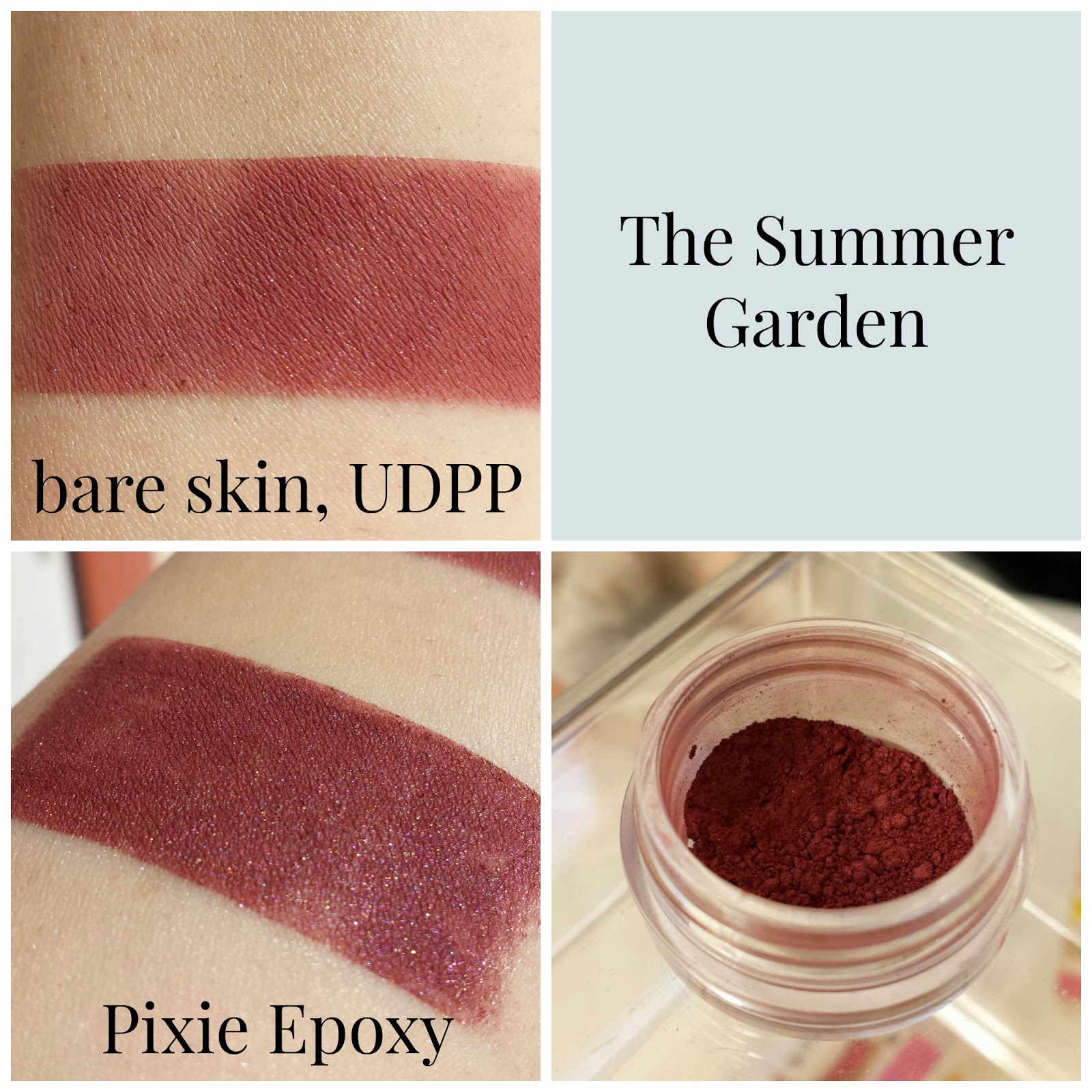
The Summer Garden: "a midtoned rosy purple", inspired by The Summer Garden and the Winter Garden
I had some issues with patchiness overall with this shadow, and it was fairly sheer over bare skin. Over bare skin and primer, I'd call this shadow a burgundy, but over Pixie Epoxy, the purple shows through.

Bluebeard: "a velvety navy blue", inspired by Bluebeard
This shadow was sheer over bare skin, but improves over primer. Over Pixie Epoxy, this shadow is by far the most gorgeous blue I've ever seen in a shadow. When I was working on taking my pictures, my fiance looked over and had me walk over to show him the swatch. That's a big deal, guys. The Epoxy picture really speaks for itself. This is wicked pigmented, and for me, this is the standout shadow of the collection. I never thought I'd like a blue shadow the way I do this one. If this shadow was a person, I'd marry them. (Sorry, Charles..)

Three Ravens: "a satiny black with strong blue undertones", inspired by The Three Ravens
This shadow has some pigmentation issues over bare skin and primer, but it's a deep blue-black over Pixie Epoxy. There are some subtle white sparkles scattered throughout.
Phew! This wraps up my review of the Kinder-und Hausmarchen Collection from Corvus Cosmetics. As I said, this post was long overdue! I'm so glad I picked up this collection, and I'd recommend it to anyone looking to add to their stash. My next post will be a comparison between Performance Colors' Zombie Bride Lipstick and Fyrinnae's Wizardry Liquid Lipstick. Stay tuned!


