Mar 16, 2015

Drooling a Bit Over Fyrinnae's Shadows and Blushes

Disclaimer: I am currently in the process of reswatching duochromes and photographing them differently to give my readers a more accurate depiction of the shifts. Please be patient while I go through the process of updating my past reviews. :)

Part two of many from my /r/CatsandCosmetics exchange extravaganza, this post centers around Fyrinnae. I received four shadows and three blushes, and I'm excited to share my thoughts with you guys! My camera was not having it with jar photos today, so some look better than others. I know my swatches are far more important, and those turned out fine. so I gave my camera a scolding and pressed on.


L-R, T-B: Rapunzel Had Extensions, Envy Me, Feisty Fennec Fox, Mephisto
Enchant, Greek Goddess, Charm

As usual, shadow swatches are taken over bare skin on the left and Fyrinnae Pixie Epoxy on the right. Blush swatches are blended out over bare skin. All quoted product descriptions are taken directly from Fyrinnae's website, which can be found here.


Rapunzel Had Extensions: "pale pink with a stunning brilliant light gold highlight"

Fyrinnae's all-time top selling shade, and for a reason. A pink-orange in the jar, this shadow applies a light gold over bare skin and Pixie Epoxy. The semi-loose formula of their shadow works so beautifully with their Pixie Epoxy; they really are a match made in heaven. This is just such a light and gorgeous shadow. I understand the hype now, and I'm kicking myself for not already having this shadow in my collection.


Envy Me: "soft tan-taupe with a green highlight"

I can absolutely vouch for the formula of this shadow, and the shadow description is spot on, but I'm not finding myself too in love with this color. I feel the green and taupe don't go well together, and it resulted in a shadow that looks a little muddy to me. If you like the color, absolutely snatch it up when you can.


Feisty Fennec Fox: "cool gray-taupe finished with a pale gold satiny highlight"

I've been on the prowl for a grey shadow that doesn't turn into a metallic silver over a primer, because I feel a lot of them do that. This is the shadow I've been looking for! The gold highlight was oh so subtle, and just enough to keep the shadow looking interesting. Without that highlight, this shadow probably would've fallen flat for me. Also, for some reason I found the way it looked in-jar absolutely adorable. Like little, cute makeup pebbles. Does anyone else think it's cute somehow? Am I crazy?


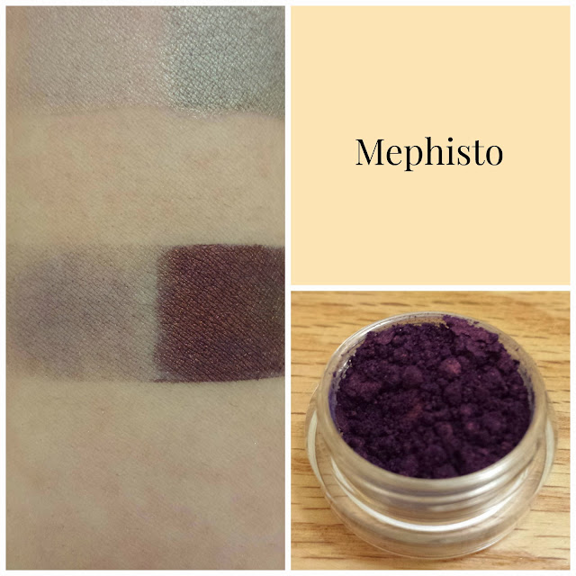
Mephisto: "a dark royal blue with a vibrant metallic red sheen"

This shadow is.. interesting. It applied very patchy, and I had to use quite a bit of product to fill in the spaces that looked sparse. I wasn't getting the right color out of it, and when I checked Fyrinnae's page, it suggested to add even more shadow to get that proper red sheen rather than the copper I was getting. That seemed a little high maintenance. By the time I went to add even more shadow, my Epoxy was dry and I decided to leave it be. Unless you're fine with packing on a lot of shadow (and possibly using two layers of primer) to get the color you see on Fyrinnae's page, this is what you get. I'll post a swatch of it after adding multiple layers if anyone's interested, but I felt it was important to show what one layer of the shadow looked like. It's a pretty shadow, but it's too high maintenance for me. This is my first time feeling frustrated with a shadow.


Enchant: "vibrant peach with a very slight touch of pink shimmer"

Fyrinnae's most popular blush since 2006, and I have to say, I'm surprised. This is a fabulous bright peach, but you would think their most popular blush would be a tad more wearable. With Enchant, and all the Fyrinnae blushes I'll be reviewing, I have to stress that these will look best on darker skin, unless you're a bit of a daredevil like me and are willing to brave the outside world with bright-ass cheeks. If you're wanting your cheeks to look less pigmented than my swatches, you need to start out with the teensiest amount imaginable. Use a stipple brush, or any brush with stiffer bristles, and pat the product on your cheeks with a light hand. Don't do anything except pat with that brush, and don't worry if it looks patchy or silly. Then take a blush brush and blend it like crazy. If it still looks a bit patchy, or if you'd like more pigmentation, repeat those steps over again. Also, for the love of Pete, do NOT dip your brush directly into the jar. That will result in pumpkin cheeks and perhaps an overturned piece of furniture. Tap some blush onto a flat surface, like the bottom of the lid, before you do anything. Don't expect to be an expert at applying these right off the bat, because you won't be. There's a learning curve for sure, but indie blushes are amazing and the struggle is worth it. #blushstruggles


Greek Goddess: "vibrant pink with a very slight pink shimmer"

Out of these three blushes, I would say this one is the tamest of them all. It still takes a light hand to apply, but it blends out to be a very pretty rosy pink rather than the pinkish coral you see in the jar. Fyrinnae states that it doesn't contain titanium dioxide or whiteners, so it's ideal for blending on darker skin. Really, I think this blush would look fabulous on a variety of skin tones.


Charm: "vibrant cool pink with the slightest touch of shimmer"

I'm not going to lie, this blush intimidated the crap out of me when I opened the jar. This is Barbie pink, and I never thought it could work. But Fyrinnae continues to surprise and impress, because this blends out to be a wearable cool pink. Honestly, I didn't think any of these three blushes could ever look okay on me. I'm excited to incorporate all three into my everyday looks!

That wraps up my post for today! I'm thinking about perhaps doing a tutorial for my next post. Some of the discussion today on IMAM has made me want to branch out and do more than just swatches and reviews, as helpful as they can be. If you have any ideas for future posts here, please let me know in the comments!

Swatches and Reviews of my First Femme Fatale Products

Aaaah, I could hear the angels singing. A light shone down from Heaven above, and down descended my little bag of Femme Fatale goodies. I recently participated in a Galentine's Day Exchange on /r/CatsandCosmetics, and along with oodles of other indies, I received these items from Femme Fatale. I was ecstatic! This review consists of three shadows and two blushes, and I'm so excited to show them off. Femme Fatale's mini jars have been restocked, so if for some crazy reason you haven't yet delved into the goodness that is Femme Fatale, do yourself a favor and place an order.


As per usual, swatches of shadows are over bare skin on the left and Fyrinnae Pixie Epoxy on the right. Blush swatches are over bare skin. All quoted product descriptions are taken directly from Femme Fatale's recently revamped site, which can be found here.


Fierce (recently renamed Rosewine, blush): "a deep maroon-tinted duochrome blush, with subtle plum undertones"

This blush is a gorgeous, pigmented reddish plum, but I have to personally build up the color otherwise it looks a little bruise-y on my skin. I know dead chic is in, but I don't think beat-up chic is in.. yet. Fierce/Rosewine is luckily, very easily to build up. The texture of the powder is very soft and easy to work with. It plays well with my brushes.


The Nightmare: "an eggplant purple base with intense golden green glimmers and sparkles"

The site photos for Femme Fatale's duochromes always look so dramatic and too good to be true. The Nightmare REALLY impressed. I tried my best to show the shift between the deep purple base and bright green shift, but I really don't think I could do it much justice. When the light hit this shadow, it transformed into a glowing green. This might be the first indie product to make me gasp a little. The Nightmare is pure sorcery.


Fire Bloom (blush): "a mid tone rose pink blush with coral undertones and a flattering copper gold shimmer"

The copper gold shimmer is really apparent in the jar, but once you blend your blush, it disappears. That's my only complaint about this one. The color is a touch more sheer than Fierce/Rosewine, so it took more product to get the pigmentation of the swatch you see here. I don't really think that's a bad thing, though; this blush can be used for a beautifully subtle rosy glow.


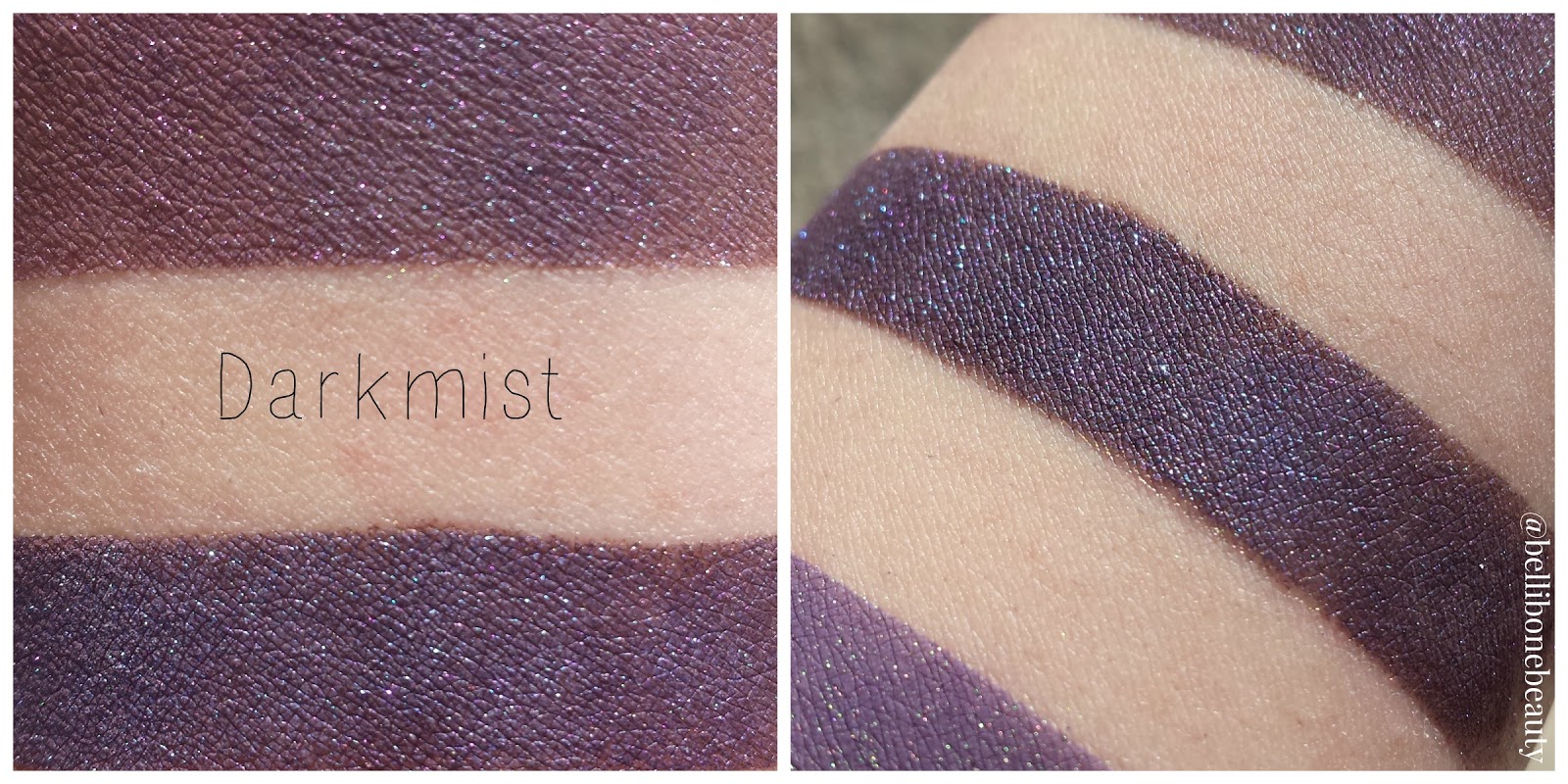
Darkmist: "a deep toned brown base with intense violet blue shimmer and teal sparkles"

Though this shadow doesn't have any shift to it, it glows in a similar way to The Nightmare. I think it's the contrast between the bright teal sparkles and dark base that make it appear to shine the way it does. All science aside, it's pretty magical. The deep brown base only showed when I swatched over bare skin. Out of all the products from Femme Fatale I received, this shadow needed a sticky base the most, and even then I could see little sparkles escaping when I swatched over the Pixie Epoxy.


Dispersion: "a deep mulberry with a bold teal blue shimmer"

The description is dead on. The deep mulberry base lights up with bright teal and blue when the light hits it. If you're pining for a shadow like this, I'd give Aromaleigh's Lucky Cat Emporium a try.

Well, that wraps up my post for today! As I said at the start of my post, I received oodles of indie goodies through the exchange, so I have a LOT more to share with you guys. My next post will be centered around Fyrinnae. I'm so excited to write about their plush shadows and neon blushes. Stay tuned!

Mar 5, 2015

What's Packed In My Travel Bag?

I was out of town for a few days recently and packed some indies for the road. I thought you guys might want to see my favorite products for easy, everyday looks. I'm in the process of replacing my mainstream company blushes/bronzers/whathaveyou with indies, so for now my travel bag indies consist of seven shadows and a highlighter!


As usual, all pictures are taken by me. Swatches are done over bare skin on the left and Fyrinnae Pixie Epoxy on the right. All quoted product descriptions are taken directly off the brands' site.


Hello Waffle "Double Trouble"- "soft apricot with pink and white sparkles"

A gorgeous My Lids But Better shadow from Hello Waffles' Kitty Kingdom Collection. (There are still quite a few shades available, so snap them up along with Double Trouble before they're gone forever!) This is a sheer apricot with lots of sparkles.


Hello Waffle "Mendelssohn"- "light pink with golden sheen"

Does this look almost identical to Double Trouble to you? It almost is, and I didn't notice until I swatched them side by side. Mendelssohn is Double Troubles' warmer cousin.


Hello Waffle "Purr-ride and Purr-rejudice"- "lady-like blush pink"

This shadow looks bubblegum pink in the jar, which would leave you to believe this wouldn't be a shade I'd use all the time. However, it blends down to a sweet pink that compliments the neutrals and golds I packed oh-so well.


Femme Fatale "Royal Tarts"- "a washed out mauve-rose base which can lean grey, and orange shimmer"

Femme Fatale is famous for shades that can look so bland in the jar, but transform when thrown over a primer. Royal Tarts is no exception, and the lack of good sun today prevented me from giving it the showcasing it deserves. This shadow shifts from a dusty mauve to a pinkish-orange, which makes it a gorgeous neutral with a little bit of pop.


Tilt/Shift "Moon"- "a deep golden taupey-brown with slight/pink purple shift and gold sparks"

I've never been able to pick up the shift in Moon, and I'd love for it to show. Maaaybe in a certain light it can lean slightly plum, but that's the best I can get out of it. The sparkle in Moon is gorgeous, but it disappears quickly and you're left with a matte brown base. It works well as a neutral, but I wish it could be as fabulous as the site description made it sound.


Aromaleigh "Marguerite"- "a rosy buff pearl frost with sparks of gold"

I don't have much to add to the site description other than it's gorgeous. This pairs so well with my golds and soft browns. It has a strong sheen and a lot of sparkle, so a sticky primer like Pixie Exopy goes a long way with Marguerite.


Shiro "Finkelstein"- "pale, ghostly yellow-green highlight"

This is such a funky highlight. Its shift ranges from yellow to green, but it also has a spattering of blue sparks. Alone, this highlight is complex and ethereal. Over a darker base it leans very green. This highlight hails from the discontinued Nightmare Before Christmas collection, but I see it pop up every once in a while in destash posts, so keep your eyes peeled! This is a must have, and I use it sparingly so I don't run out any time soon.


AFK "Mawwage"- "a shimmery pink based cream face highlighter"

And wuv, twuuu wuuv.. will fowwow you.. fowevah.. *ahem* This was my first facial powder purchase from an indie company, and for me, it's not super impressive. It's very sheer, and hard to build up. Though there's no sparkle in Mawwage, it definitely has a sheen. The sheerness plus the sheen just make me look a bit sweaty. Perhaps I still have more learning to do with application. I'll keep trying to make it work, for sure! This is one of my purchases made purely for the product name, and I'm kicking myself a bit for it. If anyone has tips for applying highlighters, please share your wisdom!

Alright, that wraps up my post for the day! I'm not sure how informative it was in the end, but it was fun to share some of my favorite neutrals and remind myself of what makes them so great. Maybe for my next post, I'll choose my favorite shadows that aren't so neutral. Let me know what posts you'd like to see in the comments section! You're all what makes writing a blog so much fun. 'til next time!